RGB vs CMYK: why screen colour never prints exactly
Screens add light, print subtracts it. That one difference explains every disappointing print run, and what you can actually do about it.
The first time a designer sends a confident, glowing blue to print and gets back something flat and slightly purple, it feels like a mistake was made somewhere. It usually was not. The colour was never printable in the first place.
Two opposite mixing models
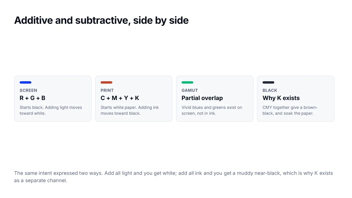
A screen starts black and adds light. Red, green and blue at full strength give white. That is additive mixing, and it is why turning everything up makes things brighter.
Print starts with white paper and subtracts light. Each ink absorbs part of the spectrum and reflects the rest. Cyan, magenta and yellow together absorb most of the visible spectrum, so they approach black — but only approach it.
That approximation is the reason K exists. Cyan, magenta and yellow at full strength produce a muddy brown-black and lay down 300% ink coverage, which soaks and buckles paper. A dedicated black ink is cheaper, sharper and drier.
Gamut is the real constraint
A gamut is the set of colours a medium can physically produce. The sRGB gamut and a typical CMYK press gamut overlap substantially in the middles, and diverge badly at the edges. Saturated blues, bright greens and neon anything live on screen and nowhere near a press.
What a CMYK conversion actually gives you
A converter with no ICC profile — including the one on this site — applies a standard formula. It knows nothing about your paper, your inks, your press or the humidity in the room. It is a reasonable starting point and an unreasonable final answer.
| What you have | What it tells you | What it cannot tell you |
|---|---|---|
| Formula CMYK | Roughly where the colour sits | How this press will render it |
| ICC-profiled CMYK | Values for a specific press and stock | Nothing, if the profile is wrong |
| A physical proof | What you are actually going to get | Nothing — this is the answer |
Practical advice
- Design the brand colour so it survives both media. If it only works in sRGB, it is not a brand colour, it is a screen colour.
- Ask your printer for their ICC profile and soft-proof against it rather than against a generic conversion.
- For anything critical — packaging, a logo, a large flat area — specify a spot colour rather than a process build.
- Get a physical proof on the actual stock. Every step before this is an estimate.
None of this makes the on-screen conversion useless. It tells you quickly whether a colour is anywhere near printable, and that is often all you need to know before a conversation with a printer.
Spot colours, and when they are worth it
There is a third option beyond RGB and CMYK. A spot colour is a specific premixed ink applied on its own plate, rather than simulated with four process inks. It reproduces exactly the same way on every run, which is why brand guidelines often specify one.
- Consistent across print runs and suppliers, which process colour is not.
- Can reach colours outside the CMYK gamut, including metallics and fluorescents.
- Costs more, because each spot colour is an additional plate.
- Worth it for a logo used at scale; rarely worth it for a one-off document.
A workflow that avoids surprises
- Decide the destination before choosing colours, and get the printer's profile if you can.
- Soft-proof in your design tool using that profile, so out-of-gamut colours are flagged early.
- Adjust the offending colours yourself rather than letting an automatic conversion decide.
- Order a physical proof for anything where colour accuracy matters commercially.
- Record both the RGB and the CMYK values in the brand guidelines, so nobody re-derives them differently.
Why K exists at all
In theory, full cyan, magenta and yellow together absorb all light and produce black. In practice they produce a muddy dark brown, because real inks are imperfect. Black is added as a fourth ink for that reason, and for two practical ones: it is cheaper than laying down three inks, and it keeps small text crisp, since a single plate cannot misregister against itself.
This is why body text should be single-ink black rather than rich black. Four plates aligning imperfectly around 9pt type produces visible colour fringing on the letterforms.
Total ink coverage
There is a limit to how much ink paper can absorb before it stops drying properly and starts offsetting onto the next sheet. Printers specify this as a total ink limit, commonly around 300 percent for coated stock, meaning the four channel percentages added together must stay under it.
It is a constraint worth knowing because it explains why a deep, dense colour that looks right on screen can come back from the press smudged or muted — the conversion had to pull ink out to stay within the limit.
- Ask the printer for their total ink limit and their profile before finalising dark colours.
- Rich black at 60/40/40/100 totals 240 percent, which is safe on most stocks.
- Registration black at 100 across all four totals 400 percent and should only be used for printer marks.
Frequently asked questions
- Why does my print look duller than my screen?
- Because a screen emits light and paper reflects it, so the brightest thing a print can be is the whiteness of the paper under the room lighting. Saturated blues, greens and oranges in particular sit outside what CMYK inks can reproduce, and the conversion maps them to the nearest achievable colour.
- Should I design in CMYK from the start?
- If the final output is print, yes — working in the destination space means you see the real constraints while you are still making choices. If the work is going to both screen and print, design in RGB and convert with a proofing step rather than designing to the lowest common denominator.
- What is rich black and why does it matter?
- Black made from all four inks rather than black alone. Pure K black on a large area can look washed out next to a photograph, so printers use a mix such as 60/40/40/100. It matters for large solid areas, not for body text, where single-ink black keeps the edges crisp.
- Can I convert a hex code to CMYK exactly?
- There is no single correct answer, because the result depends on the paper, the press and the ink set. Any converter that gives you one number without asking about the destination profile is showing you an approximation.
- Does this affect what I do on the web?
- Only when a brand colour has to exist in both places. That is a real constraint on brand colour selection: a colour that cannot be reproduced in CMYK will look different on business cards than on the site, and someone will eventually notice.
Sources
- CSS Color Module Level 4 — device-cmyk() — W3C
- <color> value syntax — MDN Web Docs