The neutral ramp is 70% of your interface
Text, borders, backgrounds, dividers and disabled states are all neutrals. Here is how to build a ramp that carries all of them.

Ask a team to describe their palette and you will hear about the brand colour. Look at an actual screen and count pixels, and the brand colour is a rounding error. Body text, rules, card backgrounds, input borders, placeholder text, disabled states — all neutrals.
How many steps
Seven to ten. Fewer and people improvise shades that never make it back into the system. More and nobody can tell 400 from 450, so the extra steps just create argument.
| Step | Typical job |
|---|---|
| 50 / 100 | Page background, subtle fills |
| 200 / 300 | Borders, dividers, disabled surfaces |
| 400 / 500 | Placeholder and disabled text, icons |
| 600 / 700 | Secondary text |
| 800 / 900 | Body text, headings |
Do not use pure grey
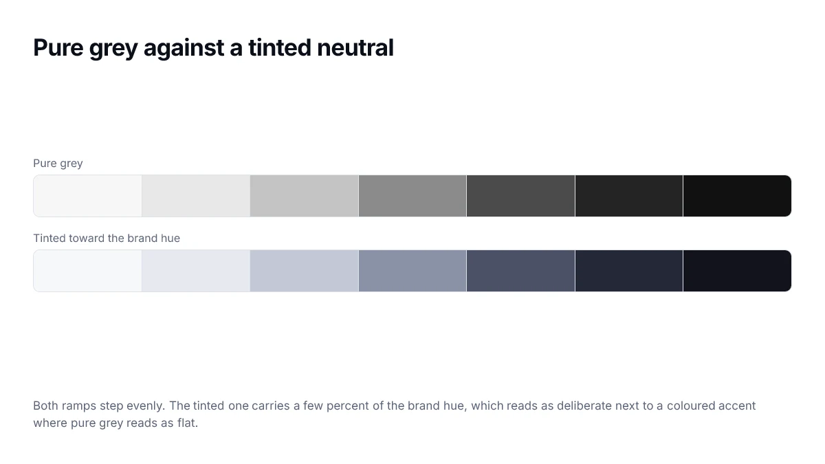
Pure grey has zero saturation, and next to a saturated brand colour it reads as lifeless. Carry two to eight percent of the brand hue through the ramp and it reads as considered instead.
Keep it subtle. Above roughly ten percent saturation people start perceiving the neutral as a colour, and you have accidentally added a second accent to your palette.
Space the steps by perception
Picking neutrals by eye produces a ramp with a bunch of similar darks and a gap somewhere in the middle. Generating them by lightness in a perceptual space fixes this in one move.
:root {
  --n-hue: 265;
  --n-chroma: 0.012;

  --n-50:  oklch(0.985 0.004 var(--n-hue));
  --n-100: oklch(0.955 0.006 var(--n-hue));
  --n-200: oklch(0.900 0.010 var(--n-hue));
  --n-300: oklch(0.820 var(--n-chroma) var(--n-hue));
  --n-400: oklch(0.700 var(--n-chroma) var(--n-hue));
  --n-500: oklch(0.600 var(--n-chroma) var(--n-hue));
  --n-600: oklch(0.500 var(--n-chroma) var(--n-hue));
  --n-700: oklch(0.400 var(--n-chroma) var(--n-hue));
  --n-800: oklch(0.280 0.016 var(--n-hue));
  --n-900: oklch(0.180 0.018 var(--n-hue));
}
Anchor the middle on contrast
Two steps are not free choices. One is the lightest neutral that still clears 4.5:1 on your page background, because that is your secondary text. Another is the darkest that white text clears on, because that is your dark surface. Find those two by measurement, then fit the rest around them.
The failure to avoid
Secondary text is where neutral ramps go wrong. A designer picks a grey that looks pleasantly quiet against white, it lands around 3:1, and now every caption, hint and helper line in the product fails. Muted is a legitimate choice; unreadable is not.
A worked ramp
The values below step lightness evenly in OKLCH while tapering chroma towards both ends, which is what stops the lightest and darkest steps looking tinted.
:root {
  --grey-50:  oklch(0.985 0.002 264);
  --grey-100: oklch(0.955 0.004 264);
  --grey-200: oklch(0.905 0.006 264);
  --grey-300: oklch(0.840 0.008 264);
  --grey-400: oklch(0.740 0.010 264);
  --grey-500: oklch(0.630 0.012 264);
  --grey-600: oklch(0.520 0.012 264);
  --grey-700: oklch(0.410 0.011 264);
  --grey-800: oklch(0.300 0.009 264);
  --grey-900: oklch(0.205 0.007 264);
  --grey-950: oklch(0.145 0.005 264);
}
Assigning roles to steps
| Role | Light theme | Dark theme |
|---|---|---|
| Page background | grey-50 | grey-950 |
| Raised surface | white | grey-900 |
| Subtle border | grey-200 | grey-800 |
| Disabled text | grey-400 | grey-600 |
| Muted text | grey-600 | grey-400 |
| Body text | grey-900 | grey-100 |
Notice that the dark column is not the light column reversed. Muted text sits at grey-400 in dark mode rather than grey-500, because a mid grey that reads as clearly secondary on white reads as almost invisible on near-black.
Warm, cool or neutral
The small amount of chroma in a ramp has a direction, and it sets the temperature of every surface in the product. The choice is a real design decision rather than a technicality, because it is applied to the largest areas on screen.
| Direction | Hue angle in OKLCH | Reads as |
|---|---|---|
| Cool | 240–270 | Technical, calm, slightly formal |
| Neutral | Any, chroma near 0.003 | Plain, recedes completely |
| Warm | 60–90 | Approachable, softer, paper-like |
A common approach is to borrow the hue of the brand colour, at a fraction of its chroma. That makes the neutrals feel related to the accent without anyone being able to name the tint, which is usually the goal.
Keeping the ramp honest over time
Ramps decay. Someone needs a border slightly darker than grey-200 and adds grey-250; six months later there are fifteen greys and no rule for choosing between them. Two habits prevent it.
- Treat the ramp as closed. A new step requires the same review as a new brand colour.
- When someone needs a value between two steps, that is evidence a semantic token is missing, not a step.
- Record which steps are legal for text on which backgrounds, so the choice is not re-litigated each time.
- Delete steps nothing references, rather than leaving them as options.
Borders are where ramps usually fail
Text gets checked. Borders rarely do, and they are the most common place a neutral ramp falls short of the requirements, because designers reach instinctively for the lightest step that is still visible on their own screen in good light.
Under WCAG 1.4.11, a border that identifies a control needs 3:1 against its surroundings. On a white background that rules out most of the top half of a typical ramp — grey-200 measures somewhere near 1.3:1 and is a very common choice for input outlines.
| Use | Requirement | Typical step on white |
|---|---|---|
| Decorative divider | None | grey-200 |
| Divider that groups content | 3:1 | grey-500 or darker |
| Input or control outline | 3:1 | grey-500 or darker |
| Focus indicator | 3:1 | A dedicated focus colour |
Splitting the ramp explicitly into decorative and functional steps, and naming them accordingly, is the cheapest way to stop the lighter values being used where they are not allowed.
Frequently asked questions
- How many steps should a neutral ramp have?
- Nine to eleven covers most interfaces. Fewer and you find yourself without a value for a specific need; more and adjacent steps become indistinguishable, so nobody can remember which to use and the choices become arbitrary.
- Why not use pure grey?
- Pure grey with zero chroma tends to look slightly dead next to a saturated brand colour, and it reads as flat on large surfaces. A very small amount of chroma, typically under 0.02 in OKLCH, warms or cools the ramp enough to feel intentional without being noticeably tinted.
- Should the dark theme reverse the same ramp?
- Not directly. Reversing produces backgrounds that are too light and text that is too dim, because perceived lightness is not symmetric around the middle. Build the dark ramp with its own lightness values, keeping the same hue and a similar chroma.
- Which step should body text use?
- Whichever one clears 4.5:1 against your background, which you determine by measuring rather than by position in the ramp. In a typical light theme that is around the seventh or eighth step of nine, not the darkest.
- Can I generate the ramp automatically?
- Yes, and you should for evenness — stepping lightness in OKLCH gives a mathematically regular ramp. What cannot be automated is deciding which steps are legal for text on which backgrounds; that requires measurement against real pairings.
Sources
- WCAG 2.2 — Contrast (Minimum) — W3C
- oklch() — MDN Web Docs