Building a dark mode palette, not an inversion
Why flipping your light palette produces muddy surfaces and glaring text, and how to build the dark ramp properly.
The tempting shortcut is to invert: take the light palette, flip the lightness, ship it. It never quite works, and the reasons are worth understanding because they point at what to do instead.
Why inversion fails
- Pure white text on pure black is uncomfortable for long reading. The high contrast causes a halation effect where glyphs appear to bleed.
- Saturated colours look considerably more intense against a dark ground. A brand blue that reads as calm on white can read as neon on near-black.
- Shadows stop working. On a dark surface a darker shadow is invisible, so the depth cue you relied on disappears.
- Your mid-tones invert into muddy territory, because the light ramp was spaced for a white ground, not a dark one.
Build the dark neutrals first
Start from a near-black that is not black. Something around #0B0F1A gives you room to place surfaces above it, and a slight blue cast reads as intentional rather than dead.
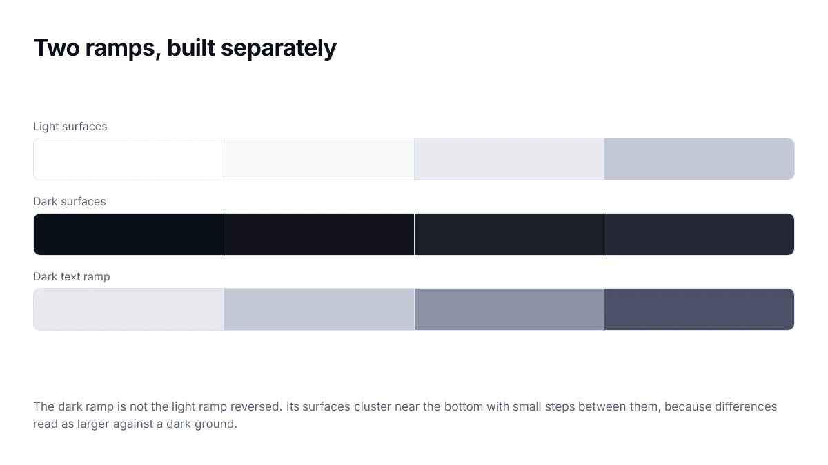
Then space your surfaces tightly. Against a dark background, small lightness differences read as larger than they would on white, so the steps between surface levels can be smaller than in your light ramp.
Elevation in dark mode is expressed by making a surface lighter, not by adding a shadow. A card sitting above the page background is a step up the neutral ramp.
Then adjust the accents
Most brand colours need slightly less saturation and slightly more lightness in dark mode. The goal is a colour that still reads as the brand without vibrating against the background.
:root {
  --surface: oklch(0.99 0 0);
  --text:    oklch(0.16 0.01 265);
  --brand:   oklch(0.53 0.24 264);
}

:root:not([data-theme="light"]) {
  @media (prefers-color-scheme: dark) {
    --surface: oklch(0.16 0.012 265);
    --text:    oklch(0.97 0.003 265);
    /* lighter and a touch less chromatic */
    --brand:   oklch(0.68 0.19 264);
  }
}
Re-check every pairing
This is the step people skip. A palette that clears 4.5:1 everywhere on white will have pairings that fail on dark, because the same mid-tone now sits much closer to its background.
Go through each text-on-surface combination you actually ship and measure it against the dark background, not the light one. Muted secondary text is where this fails most often.
A short checklist
- Near-black background, not pure black.
- Off-white text, not pure white.
- Surfaces get lighter as they rise; no shadows for elevation.
- Accents lightened and slightly desaturated.
- Every text pairing re-measured against dark surfaces.
- Images and illustrations checked — a white-background logo will glare.
Elevation is lightness, not shadow
In a light theme, a raised surface is signalled with a shadow. On a dark background a shadow is nearly invisible, because there is very little light to occlude. Dark themes signal elevation by making raised surfaces lighter instead.
| Level | Used for | Approximate lightness |
|---|---|---|
| Base | Page background | 8–10% |
| Raised | Cards, panels | 12–14% |
| Overlay | Dropdowns, popovers | 16–18% |
| Dialog | Modals | 18–22% |
The steps need to be small enough to read as depth rather than as different colours, and large enough to be visible on a dim screen. Two to four points of lightness per level is a reasonable starting range.
The flash of the wrong theme
A dark-mode implementation that reads its stored preference in a normal script will paint the light theme first and then correct itself, which is visible and unpleasant. The fix is a small blocking script in the head that sets a data attribute on the root element before any content renders.
Images and media in dark mode
Colours are only part of a theme. A logo exported as black artwork disappears against a dark surface, screenshots with white backgrounds glare, and illustrations tuned for a light page can look like cut-outs. These are usually discovered after launch, because they live outside the palette.
- Provide logos as SVG with currentColor where possible, so they follow the text colour.
- Give screenshots a border or a slightly raised surface, so the white does not float.
- Consider a small reduction in image brightness under a dark theme, applied with a filter.
- Use the picture element with a media query for illustrations that genuinely need two versions.
[data-theme="dark"] img:not([src$=".svg"]) {
  filter: brightness(0.92);
}
Apply that filter sparingly and never to product photography or anything where colour accuracy is the point. It is a reasonable default for decorative imagery and a bad one for a shop.
Do not forget the browser chrome
The colour-scheme property tells the browser which theme is in use, so scrollbars, form controls, selection highlights and the canvas behind your page all render to match. A dark page with a light scrollbar is the usual symptom of forgetting it, and it is a one-line fix rather than a styling exercise.
Frequently asked questions
- Should dark mode use pure black?
- Usually not. Pure black against light text produces very high contrast that many people find uncomfortable for extended reading, and it leaves you no room to indicate elevation, since anything raised must be lighter. A very dark neutral around 8 to 12 percent lightness works better.
- Why do my brand colours look wrong in dark mode?
- Because a saturated colour that reads as vivid against white reads as dark and muddy against a dark background. The usual fix is to lift lightness and reduce chroma slightly for the dark theme, keeping the hue so the colour is still recognisably yours.
- How do I show elevation without shadows?
- Shadows barely register on a dark background, so use lightness instead. Each level of elevation gets a slightly lighter surface, which is why starting from pure black is limiting — it removes the direction you need to move in.
- Should dark mode follow the system setting or a toggle?
- Both. Default to the system preference with prefers-color-scheme, and offer a toggle that overrides it, because people's preference for a specific site often differs from their system-wide choice. Persist the override and apply it before first paint to avoid a flash.
- Do contrast requirements change in dark mode?
- The thresholds are identical. What changes is that a palette which passes in light mode gives no information about whether its dark counterpart passes, so every pairing has to be measured again.
Sources
- WCAG 2.2 — Contrast (Minimum) — W3C
- prefers-color-scheme — MDN Web Docs