Sampling colour from an image, and the traps in it
Picking a colour off a photograph looks trivial and quietly is not. Compression, colour profiles and a single-pixel sample all conspire against you.
Everyone assumes eyedropper sampling is exact. You click a pixel, you get its value, and the value is correct — for that pixel. Whether that pixel represents the colour you meant is a separate question.
JPEG averages colour across blocks
JPEG stores brightness at higher resolution than colour, and processes the image in blocks. In a smooth area this is invisible. Near a hard edge — the boundary of a logo, text over a photograph — adjacent pixels get their colour smeared together, and a sample taken there can be noticeably off.
Practical rule: sample from the middle of a flat area, never within a few pixels of a strong edge. If you must sample near an edge, take several samples further in and compare.
Colour profiles shift things
An image tagged with a wide-gamut profile gets converted for display. What you sample from a canvas may not be what the file contains, and what the file contains may not be what the photographer saw. For anything precise, work from a lossless source in a known profile.
One pixel is a small sample
Photographs contain sensor noise. Two neighbouring pixels in what looks like flat sky can differ by several values in each channel. Sampling three or four points across the region and looking at the spread tells you far more than a single click.
You may be sampling the light
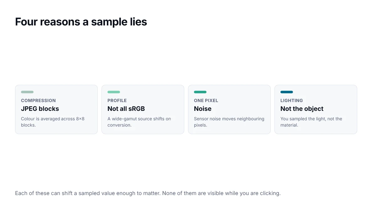
This is the conceptual one. If you sample a red car photographed at sunset, you get the colour of that car under that light. It is not the car's colour in any transferable sense. For brand work this matters — the swatch you pull off a photograph of packaging is lighting plus ink, not ink.
A workflow that holds up
- Start from the highest-quality source available. A PNG or the original asset beats a screenshot of a JPEG.
- Sample several points in the region, not one.
- Compare the samples. A tight cluster means you can trust it; a wide spread means the region is not as flat as it looked.
- Take the result into the picker and adjust deliberately — usually normalising the lightness so it fits your existing ramp.
- Check the final colour against your contrast requirements before using it for anything with text on it.
Sampling is a great way to find a starting point and a poor way to finish. Treat what the eyedropper hands you as a suggestion.
Sampling programmatically
When you need an average rather than a point, reading a small region and taking the mean is more reliable than any single pixel — and the spread tells you whether to trust the result.
function sampleRegion(ctx, x, y, size = 9) {
  const { data } = ctx.getImageData(x, y, size, size);
  let r = 0, g = 0, b = 0;
  const n = data.length / 4;
  for (let i = 0; i < data.length; i += 4) {
    r += data[i]; g += data[i + 1]; b += data[i + 2];
  }
  return [r / n, g / n, b / n].map(Math.round);
}
getImageData on a canvas that has drawn a cross-origin image throws a security error unless the image was requested with CORS enabled. This is the failure people hit first, and it is a browser security boundary rather than a bug to work around.
Averaging in the wrong space
The function above averages gamma-encoded values, which is the conventional approach and fine for a roughly uniform region. Across a region with strong light and dark areas it produces a result that is too dark, because the encoding is not linear. If accuracy matters there, linearise each channel before averaging and re-encode afterwards — the same transfer function used in the contrast calculation.
Extracting a palette rather than a colour
A related task is pulling several representative colours out of an image — for a themed card background, or to tint an interface to match cover art. The naive approach of counting exact pixel values fails immediately, because a photograph contains thousands of near-identical shades and none of them dominates.
- Quantise first, reducing each channel to a coarse set of buckets, so similar pixels group together.
- Discard near-white and near-black buckets, which are usually background and shadow rather than subject.
- Rank the remaining buckets by count, then by chroma, so a large dull region does not beat a smaller vivid one.
- Adjust the winners to a fixed lightness before using them, so the interface stays predictable across images.
That last step is the one people skip and then regret. An extracted colour used directly produces cards that are unreadable whenever the source image happens to be pale, because nothing constrained the lightness. Pinning lightness and keeping only the hue gives a themed result that still meets contrast.
When not to sample at all
If a brand has published guidelines, use the published value. Sampling a logo from a compressed screenshot to recover a brand colour produces something close to but not exactly the real value, and the difference will show up when your version sits next to the official one.
The same applies to accessibility work. Sampling a colour off a rendered screenshot to check contrast introduces error from compression and scaling; read the value from the stylesheet instead.
Frequently asked questions
- Why does the colour I picked look different when I paste it?
- Usually a colour profile conversion. If the source image is tagged with a wide-gamut profile and your destination assumes sRGB, the same numbers describe a different colour. Working from a lossless source in a known profile removes most of these surprises.
- Is the EyeDropper API accurate?
- It accurately reports the pixel it sampled. Whether that pixel represents the colour you meant is a separate question, and depends on compression, profile and where in the region you clicked.
- How do I get a brand colour from a logo image?
- Ideally you do not — ask for the brand guidelines, which will state the value. If you must sample, use a vector or lossless source, sample well inside a flat area rather than near an edge, and take several samples to confirm they agree.
- Why do my samples from a photograph vary so much?
- Sensor noise, compression and lighting all vary across a region that looks flat. That variation is information: a tight cluster of samples means the region really is uniform, and a wide spread means a single sample would have been misleading.
- Can I sample a colour from a video frame?
- Yes, by drawing the frame to a canvas and reading the pixel data, but video compression is more aggressive than still-image compression, so the caveats about blocks and averaging apply more strongly.
Sources
- EyeDropper API — MDN Web Docs
- CanvasRenderingContext2D.getImageData() — MDN Web Docs