WCAG colour contrast, explained without the jargon
What the 4.5:1 and 3:1 ratios actually mean, how the number is calculated, and the quickest ways to fix a colour that fails.
Contrast ratio is a single number describing how far apart two colours are in perceived brightness. It runs from 1:1, meaning identical, to 21:1, which is pure black against pure white. The Web Content Accessibility Guidelines set minimums that text has to clear.
The thresholds worth memorising
| Content | AA minimum | AAA minimum |
|---|---|---|
| Body text | 4.5:1 | 7:1 |
| Large text (18pt, or 14pt bold) | 3:1 | 4.5:1 |
| Icons and UI borders | 3:1 | — |
| Decorative elements | No requirement | — |
AA is the level most organisations are held to, and the one referenced by accessibility legislation in a lot of countries. AAA is a target, not usually a requirement.
How the number is worked out
It is not a simple difference in lightness. Each channel is first converted from sRGB to linear light, because screens do not emit light in proportion to their input values. Those linear values are then weighted — green counts for far more than blue, because human eyes are most sensitive to green.
L = 0.2126 x R + 0.7152 x G + 0.0722 x B

contrast = (L_lighter + 0.05) / (L_darker + 0.05)
The 0.05 term models the light a real screen reflects even when displaying black, which is why the scale tops out at 21 rather than infinity.
Why green matters so much
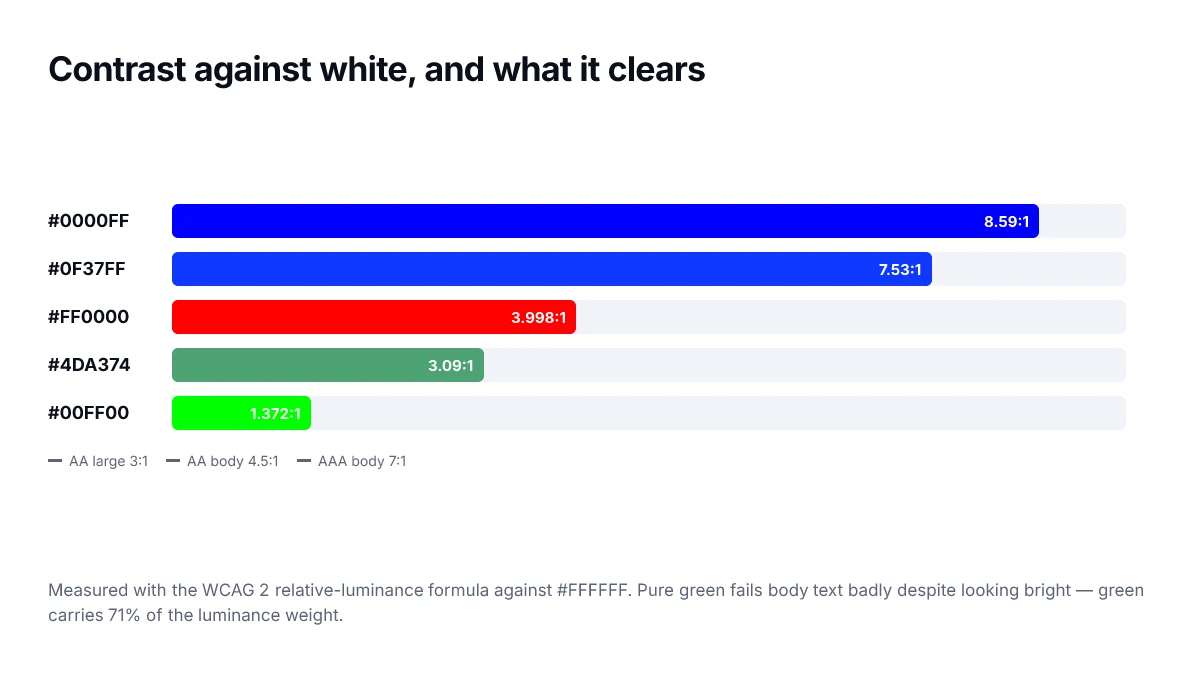
Because green carries 71% of the weight, changing it moves the ratio far more than changing blue. A colour can look considerably different to the eye and barely shift its contrast score if the change was mostly in the blue channel.
Fixing a colour that fails
- Adjust lightness first. In HSL this is one number and it moves the ratio quickly.
- If the colour must stay recognisable, keep the hue and saturation and only push lightness away from the background.
- For a brand colour you cannot change, use it as a background with white or near-black text rather than as text on white.
- Increase the font size or weight — large text only needs 3:1, which is a much easier target.
- Never rely on colour alone to convey meaning. Add an icon, underline or label.
A common mistake
Placeholder text, disabled states and secondary labels are the usual failures, because designers deliberately mute them. Muted is fine; unreadable is not. If a disabled control genuinely does not need to be read, that is defensible — but secondary body text always does.
Every colour page here shows the ratio against both white and black, with the AA and AAA verdicts, so you can check a colour before it reaches production.
Where teams commonly fail without noticing
- Placeholder text styled as a light grey, which is text and must meet 4.5:1.
- Text over a photograph, where the ratio changes across the image.
- Brand-coloured links on a tinted background section, checked only against white.
- Hover and active states, which are frequently lighter than the resting state.
- Dark mode, where a palette that passes in light mode is inverted without re-measuring.
Contrast is a floor, not a target
A ratio of 4.5:1 is the point at which text stops being a conformance failure. It is not the point at which text becomes comfortable. Long-form reading is easier somewhere above 7:1, and body text set at exactly the threshold tends to feel washed out on a dim screen or in bright ambient light.
The practical approach is to treat the threshold as a hard minimum for incidental text — captions, metadata, timestamps — and give primary reading content considerably more headroom than the standard requires.
Testing the whole page, not one pairing
Checking a single swatch pair tells you about that pair. Real pages layer text over gradients, images and tinted panels, and the same colour can pass in one context and fail two hundred pixels lower. Run an automated pass over rendered pages, then look manually at anything that sits on a non-flat background.
What counts as large text
The relaxed 3:1 threshold applies to large text, and the definition is more specific than most people remember. Large means at least 18.66 pixels if bold, or at least 24 pixels otherwise. A 20-pixel regular heading is not large text by this definition and needs the full 4.5:1.
The thresholds are defined in CSS pixels at default zoom, so a heading sized in rem needs converting before you can tell which rule applies.
This catches teams out with subheadings and card titles, which frequently sit in the range between comfortable and technically large, and get styled with a muted colour on the assumption that headings are exempt.
Frequently asked questions
- What contrast ratio do I actually need to pass?
- 4.5:1 for normal body text and 3:1 for large text, which means 18.66px bold or 24px regular and above. Interface components and meaningful graphics also need 3:1. The stricter AAA level asks for 7:1 and 4.5:1 respectively, which is worth targeting for long-form reading but is not the common legal baseline.
- Does a contrast checker guarantee my site is accessible?
- No. It checks one success criterion out of many. A page can pass every contrast measurement and still be unusable because it relies on colour alone to convey meaning, has no visible focus indicator, or cannot be operated by keyboard. Contrast is necessary, not sufficient.
- WCAG exempts inactive controls from the contrast requirements. That said, users still need to perceive that a control exists and is disabled, so a completely invisible disabled state is a usability problem even where it is not a conformance failure.
- Because yellow is close to white in luminance. The formula weights green heavily, and yellow is red plus green, so it lands very high on the luminance scale. White on yellow typically measures below 1.5:1. Dark text on yellow is the fix.
- Does contrast apply to placeholder text in form fields?
- Yes. Placeholder text is text, and it commonly fails because designers style it as a very light grey. If the placeholder carries information the user needs, it must meet 4.5:1 — and information the user needs generally belongs in a visible label instead.