Theming with CSS custom properties, without a build step
One set of tokens, a light and dark definition, and a toggle that respects the system setting and remembers a choice.
Theming used to need a preprocessor and two compiled stylesheets. Custom properties made it a runtime concern, and the whole thing now fits in about thirty lines.
Define the full palette once
Put every token on bare :root as the light definition. This is your complete set, and it is what any browser gets if nothing else matches.
:root {
  --surface: oklch(0.99 0 0);
  --surface-raised: #ffffff;
  --text: oklch(0.16 0.01 265);
  --text-muted: oklch(0.53 0.015 265);
  --border: oklch(0.92 0.006 265);
  --action: oklch(0.53 0.24 264);
}
Redefine only what changes
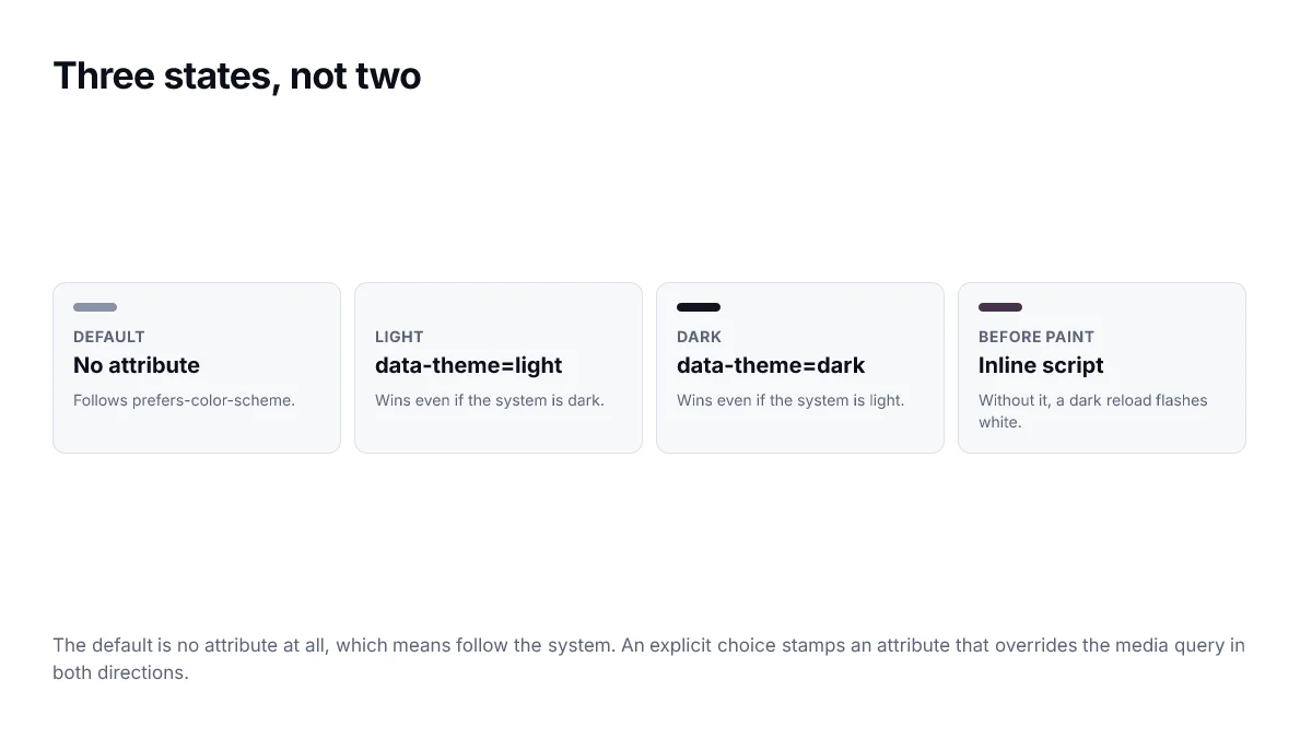
Two blocks. One under the dark media query, guarded so an explicit light choice can escape it. One under the dark attribute, so an explicit dark choice wins on a light system.
@media (prefers-color-scheme: dark) {
  :root:not([data-theme="light"]) {
    --surface: oklch(0.16 0.012 265);
    --surface-raised: oklch(0.20 0.014 265);
    --text: oklch(0.97 0.003 265);
    --text-muted: oklch(0.70 0.015 265);
    --border: oklch(1 0 0 / 12%);
    --action: oklch(0.68 0.19 264);
  }
}

:root[data-theme="dark"] {
  --surface: oklch(0.16 0.012 265);
  --surface-raised: oklch(0.20 0.014 265);
  --text: oklch(0.97 0.003 265);
  --text-muted: oklch(0.70 0.015 265);
  --border: oklch(1 0 0 / 12%);
  --action: oklch(0.68 0.19 264);
}
The :not([data-theme="light"]) guard is the part people miss. Without it a user on a dark system who explicitly picks light gets ignored, because the media query still matches.
Apply the choice before first paint
If you set the theme from a React effect, the page renders light and then snaps to dark. The fix is a small synchronous script in the head, before any stylesheet-dependent paint.
<script>
  (function () {
    try {
      var stored = localStorage.getItem("theme");
      var dark = stored
        ? stored === "dark"
        : matchMedia("(prefers-color-scheme: dark)").matches;
      if (dark) document.documentElement.setAttribute("data-theme", "dark");
    } catch (e) {}
  })();
</script>
Wrap it in try/catch. Private browsing modes throw on localStorage access, and an exception here would block the rest of the page.
Tell the browser too
:root { color-scheme: light dark; }This makes form controls, scrollbars and the space behind your page follow the theme. Without it you get a dark page with light native widgets, which looks broken in a way that is hard to place.
One thing to watch
Give the body an explicit background from a token. A transparent body borrows whatever the host paints behind it, which is how a correctly-themed page still manages to show a white flash on scroll overrun.
The complete pattern
Three blocks, in this order, give you system preference by default and a working override in both directions.
:root {
  color-scheme: light;
  --surface: oklch(0.985 0.002 264);
  --text:    oklch(0.205 0.007 264);
}

/* system preference, unless the user explicitly chose light */
@media (prefers-color-scheme: dark) {
  :root:not([data-theme="light"]) {
    color-scheme: dark;
    --surface: oklch(0.145 0.005 264);
    --text:    oklch(0.955 0.004 264);
  }
}

/* explicit choice always wins */
:root[data-theme="dark"] {
  color-scheme: dark;
  --surface: oklch(0.145 0.005 264);
  --text:    oklch(0.955 0.004 264);
}
Never define a colour only inside a media query or an attribute selector. Every token needs a value on the bare root, otherwise a viewer in a state you did not anticipate gets no value at all.
The blocking script
<script>
  try {
    var t = localStorage.getItem("theme");
    if (t) document.documentElement.dataset.theme = t;
  } catch (e) {}
</script>
The try/catch is not defensive padding. Storage access throws outright in some privacy configurations, and an uncaught error here runs before anything else on the page.
Scoping a theme to part of a page
Because custom properties inherit, the same mechanism that themes the whole document will theme a subtree. Setting the attribute on a section rather than the root gives you an inverted panel, a dark hero on a light page, or a preview pane that shows the opposite theme, with no duplicate styles.
<section data-theme="dark">
  <!-- everything in here resolves against the dark tokens -->
</section>
One caveat: anything that escapes the subtree in the DOM escapes the theme with it. A dropdown or tooltip rendered into a portal at the end of the body will pick up the root tokens, not the section's, which is a frequent source of a light popover appearing over a dark panel.
Testing both themes without clicking through twice
The most reliable way to keep two themes correct is to make the wrong one visible during development rather than at review time.
- Render a page fragment twice side by side, once under each theme attribute, in a component gallery.
- Run automated contrast checks against both, not just the default.
- Grep for any colour literal outside the token definitions — each one is a value that will not switch.
- Check form controls, scrollbars and selection highlights, which are governed by colour-scheme rather than your tokens.
- Confirm the blocking script runs before first paint by throttling the network and watching for a flash.
The third step catches the most bugs in practice. A theme fails not because the mechanism is wrong but because one component hardcoded a grey two years ago and nobody has looked at it since.
Naming the properties
Custom property names are the interface between the palette and everything that uses it, so they outlive most other decisions in a codebase. Two conventions save a lot of churn: name by role rather than appearance, and keep the theme out of the name.
- Prefer --surface over --white, because in dark mode the second one is a lie.
- Prefer --text-muted over --grey-600, so the value can change without the name becoming wrong.
- Avoid --surface-light and --surface-dark as separate properties; one property whose value differs per theme is the point.
- Keep a small number of primitives with appearance-based names, and have the semantic properties reference them.
The distinction between the two layers is worth the extra indirection. Primitives let a designer say which blue; semantics let a component say what the colour is for. Only the second belongs in component code.
Frequently asked questions
- Why does my site flash the wrong theme on load?
- Because the stored preference is being read after the first paint. Move that read into a small blocking script in the head that sets a data attribute on the root element, so the correct tokens are in place before any content renders.
- Should I use a class or a data attribute for the theme?
- Either works. A data attribute reads slightly better in selectors and avoids colliding with utility classes, which is why data-theme is the common choice. What matters more is that it sits on the root element, so every custom property below it is affected.
- How do I support system preference and a manual override together?
- Define the light palette on the root, redefine it under a prefers-color-scheme media query guarded so an explicit light choice wins, and redefine it again under the explicit dark attribute. That ordering lets the system setting apply by default and the toggle override it in both directions.
- What is colour-scheme for?
- It tells the browser which theme the page is using, so form controls, scrollbars and the default canvas are rendered to match. Without it you can have a correctly themed page with light scrollbars and light-styled inputs.
- Do custom properties cost performance?
- Not meaningfully at the scale of a palette. Changing a property on the root does invalidate styles for everything that references it, which is exactly what a theme switch wants. Thousands of properties changing every frame would matter; a theme toggle does not.
Sources
- Using CSS custom properties — MDN Web Docs
- prefers-color-scheme — MDN Web Docs
- color-scheme — MDN Web Docs