How to build a colour palette for an interface
A repeatable method for going from one brand colour to a full interface palette that stays readable and consistent.

Most interface palettes fail in the same way: they are assembled colour by colour until something looks right, then fall apart when a new component needs a shade nobody planned for. A palette built as a system does not have that problem.
Start with roles, not colours
Before choosing anything, write down what the interface needs a colour for. Almost every product needs the same short list.
- A primary colour for the main action on a page.
- A neutral ramp for text, borders, backgrounds and surfaces.
- Feedback colours for success, warning, error and information.
- Optionally one accent for highlights and illustration.
That is four or five hues in total. Palettes go wrong by having too many, not too few.
Build the neutral ramp first
Neutrals cover the vast majority of any interface, so they matter most. Pure grey looks lifeless next to a coloured brand, so give your greys a slight tint of the primary hue — a saturation of 2 to 8% is enough to feel intentional without reading as coloured.
Aim for seven to ten steps. Fewer and you will be forced to improvise; more and nobody will be able to tell them apart or remember which to use.
Place the primary by contrast, not by taste
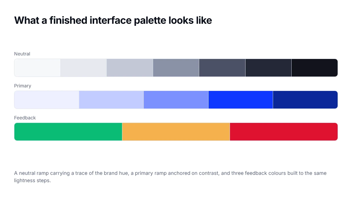
Your primary colour has a job: it must be readable as a button background with white text, and readable as text on a white background. Those two demands usually cannot be met by the same shade, so plan for two.
- Take the brand hue and find the lightness where it hits 4.5:1 against white — that is your text shade.
- Find the lightness where white text on it hits 4.5:1 — that is your surface shade.
- Generate the rest of the ramp around those two anchors.
Keep steps perceptually even
Generate the ramp by varying lightness in a perceptual space rather than by eye. In OKLCH, an even sequence of lightness values produces an even-looking ramp; in HSL it will not.
:root {
  --primary-50:  oklch(0.97 0.02 264);
  --primary-200: oklch(0.88 0.09 264);
  --primary-500: oklch(0.53 0.24 264); /* surface shade */
  --primary-700: oklch(0.42 0.21 264); /* text shade */
  --primary-900: oklch(0.28 0.14 264);
}
Feedback colours need the same treatment
Success, warning and error are not single colours — each needs a background tint, a border and a text shade, all of which must clear contrast requirements. Build them as small ramps using the same lightness anchors as the primary, so the whole system feels related.
Test before you ship
- Check every text-on-background pair against 4.5:1.
- View the palette in greyscale — if two states become indistinguishable, colour is doing too much work.
- Check it in dark mode, where the neutral ramp usually needs to be rebuilt rather than inverted.
- Confirm the primary still stands out when surrounded by the rest of the palette.
You can work through all of this here: pick your brand colour, read its tint and shade ladders for the ramp, use the harmony schemes for accents, and check every pairing with the contrast panel.
Document the decisions, not just the values
A palette that ships as a list of hex codes gets misused within a month, because nothing records what each colour is for. The useful artefact is a table of roles: what the colour means, where it is allowed, and what it must contrast against.
| Token | Role | Must contrast with |
|---|---|---|
| surface | Page background | text, text-muted |
| surface-raised | Cards and panels | text, border |
| text | Primary reading colour | surface at 4.5:1 or better |
| text-muted | Metadata and captions | surface at 4.5:1 |
| border | Dividers and input outlines | surface at 3:1 |
| action | Primary buttons and links | surface at 3:1, own label at 4.5:1 |
The review that catches most problems
Before a palette is adopted, assemble one page that uses every token in the context it is meant for — a form, a card, a table, an alert of each severity, a disabled control, and a focus state. Most palette failures are invisible in a swatch grid and obvious the moment real components are on screen.
Frequently asked questions
- How many colours does a design system actually need?
- Fewer than most teams start with. A neutral ramp of nine to eleven steps, one primary with a handful of steps, one accent, and four feedback colours covers the overwhelming majority of interface work. Extra hues have to earn a distinct meaning users can learn, and most do not.
- Should I generate my palette from one brand colour?
- It is a reasonable starting point for the primary ramp, but generating the neutrals from the brand hue usually produces greys that fight with the accent. Build the neutrals with a very small amount of chroma chosen independently, then place the brand colour against them.
- What is the difference between a primitive and a token?
- A primitive is a raw value with a descriptive name, such as blue-600. A token is a role with a semantic name, such as colour-action-primary, that points at a primitive. Components reference tokens, so a rebrand or a theme change edits the mapping rather than every component.
- How do I know when a palette is finished?
- When every text and background pairing your components actually produce has been measured and passes, in both themes, and when adding a new component does not require inventing a new colour. If designers keep reaching for values outside the palette, a role is missing.
- Do I need a separate palette for dark mode?
- Not a separate palette, but a separate mapping. The primitives can be shared; what changes is which primitive each semantic token points at, plus usually a small lift in accent lightness because saturated colours read darker against dark backgrounds.
Sources
- WCAG 2.2 — Contrast (Minimum) — W3C
- Using CSS custom properties — MDN Web Docs
- oklch() colour function — MDN Web Docs