CSS gradients: linear, radial and colour stops
How gradient syntax really works, why gradients turn muddy in the middle, and the fixes that make them look smooth.
A CSS gradient is a generated image, not a colour. That is the single most useful thing to know about them: it explains why they go in background rather than background-color, and why they can be layered, sized and repeated like any other image.
Linear gradients and the angle
The angle names the direction the gradient travels towards. 0deg goes upward, 90deg to the right, 180deg downward. This trips people up because it is measured clockwise from north, unlike most maths conventions.
/* these two are identical */
background: linear-gradient(90deg, #0F37FF, #5CBEFF);
background: linear-gradient(to right, #0F37FF, #5CBEFF);
Colour stops and positions
Without positions, stops are spread evenly. Add a percentage or length to pin a stop exactly. Two stops at the same position create a hard edge instead of a blend, which is how you draw stripes without an image.
/* a hard split at the halfway point */
background: linear-gradient(90deg, #0F37FF 50%, #5CBEFF 50%);
Why gradients go grey in the middle
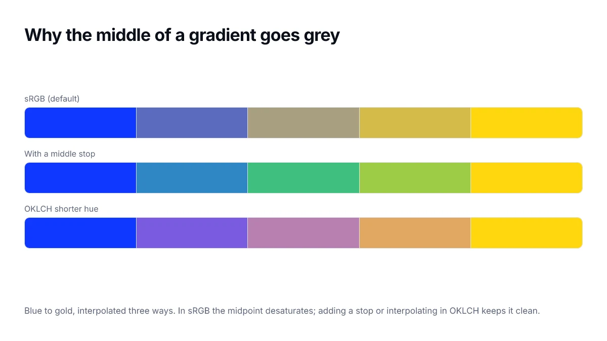
Browsers interpolate in sRGB by default, and the straight line between two saturated hues in that space passes through a desaturated region. Blue to yellow is the classic offender: the midpoint comes out a muddy grey rather than a clean green.
- Add an intermediate stop in the hue you actually want the middle to be.
- Or interpolate in a perceptual space, which modern browsers support directly.
/* let the browser take the short way round the hue wheel */
background: linear-gradient(in oklch shorter hue, #0F37FF, #FFD70F);Radial gradients
Radial gradients start from a point and spread outward. You control the shape, the size and the origin. circle keeps it round regardless of the box; ellipse, the default, stretches to match.
background: radial-gradient(circle at 30% 20%, #5CBEFF, #0F37FF 70%);Fading to transparent, properly
Fading to the transparent keyword is the most common gradient bug. In sRGB, transparent means transparent black, so the fade darkens as it disappears. Fade to the same colour at zero alpha instead.
/* wrong — grey haze near the end */
background: linear-gradient(90deg, #0F37FF, transparent);

/* right */
background: linear-gradient(90deg, #0F37FF, rgb(15 55 255 / 0));
Banding on large areas
Across a wide area with a narrow colour range, 8-bit steps become visible as stripes. Widen the range slightly, add a barely visible noise texture on top, or shift the angle so bands do not align with the screen edge.
The gradient builder here writes all of this for you: drag stops, set the angle, switch between linear and radial, and copy the finished declaration.
Interpolating in a different colour space
Modern CSS lets you name the space the browser interpolates through, which solves the muddy-midpoint problem at the source rather than by patching it with extra stops.
/* passes through the desaturated centre of sRGB */
.a { background: linear-gradient(90deg, #0F37FF, #FFD400); }

/* keeps chroma up across the whole transition */
.b { background: linear-gradient(in oklch, #0F37FF, #FFD400); }

/* takes the shorter way round the hue circle */
.c { background: linear-gradient(in oklch shorter hue, #0F37FF, #FFD400); }
The hue interpolation keyword matters more than it looks. With longer hue, a blue-to-yellow gradient travels the long way round the wheel and passes through green and red on the way — occasionally what you want, usually a surprise.
Conic gradients
The third type sweeps around a centre point rather than along a line. It is the straightforward way to draw a pie chart, a colour wheel or a progress ring without any SVG.
.ring {
  background: conic-gradient(var(--accent) 0turn 0.7turn, var(--muted) 0.7turn 1turn);
  border-radius: 50%;
}Repeating gradients and patterns
The repeating variants take the same syntax and tile the stop sequence, which turns gradients into a pattern engine. Stripes, checks and grid overlays that would otherwise be images become a single declaration that scales to any size and themes with your custom properties.
/* diagonal stripes */
.stripes {
  background: repeating-linear-gradient(
    45deg,
    var(--surface) 0 10px,
    var(--surface-raised) 10px 20px
  );
}

/* a grid overlay, two gradients layered */
.grid {
  background-image:
    linear-gradient(var(--border) 1px, transparent 1px),
    linear-gradient(90deg, var(--border) 1px, transparent 1px);
  background-size: 24px 24px;
}
Layering is the part worth remembering. The background-image property accepts a comma-separated list, painted front to back, so several gradients can combine into an effect that no single one produces.
Accessibility and motion
Two things to keep in mind. Text placed over a gradient has a contrast ratio that changes along the gradient, so it must be measured at the worst point rather than the middle. And animated gradients can be a problem for people sensitive to motion, so gate any continuous animation behind a reduced-motion query.
@media (prefers-reduced-motion: reduce) {
  .animated-gradient { animation: none; }
}
Gradients on text and borders
Two places a gradient can go that are not a background. Applying one to text requires clipping the background to the glyphs, and applying one to a border requires border-image, because border-color does not accept a gradient.
.gradient-text {
  background: linear-gradient(90deg, var(--accent), var(--accent-2));
  -webkit-background-clip: text;
  background-clip: text;
  color: transparent;
}

.gradient-border {
  border: 2px solid transparent;
  background:
    linear-gradient(var(--surface), var(--surface)) padding-box,
    linear-gradient(90deg, var(--accent), var(--accent-2)) border-box;
}
Gradient text has a real accessibility cost. The measured contrast varies across every letter, and the technique relies on a transparent colour, so any browser that fails to apply the clip renders invisible text. Keep it for short display headings, never for body copy, and check the lightest point of the gradient against the background.
The border trick works by layering two backgrounds with different clipping boxes. It is the standard approach because border-image cannot easily produce a rounded gradient border.
Frequently asked questions
- Why does my gradient look grey in the middle?
- Because the browser interpolates in sRGB by default, and the straight line between two saturated hues passes near the desaturated centre of that space. Adding an intermediate stop at the hue you want, or interpolating in oklch, keeps the midpoint saturated.
- Are CSS gradients bad for performance?
- No. They are painted by the compositor and cost nothing to download, which makes them considerably cheaper than an image of the same gradient. Very large gradients that are repainted on every frame can cost something, but a static background gradient is effectively free.
- How do I fade an image out without a grey edge?
- Fade to the same colour with zero alpha rather than to the transparent keyword. The keyword resolves to transparent black, so interpolating towards it drags the colour through grey. Use rgb(255 255 255 / 0) against white, for example.
- Can a gradient have a hard edge?
- Yes. Place two stops at the same position, as in linear-gradient(#000 50%, #FFF 50%), and the transition becomes a hard line. This is how stripe and bar patterns are built without any images.
- What angle does 0deg mean in a linear gradient?
- 0deg points to the top, and angles increase clockwise, so 90deg points right. This differs from the convention in some graphics tools, which is a common source of gradients that come out rotated a quarter turn from what was intended.
Sources
- CSS Images Module Level 3 — gradients — W3C
- linear-gradient() — MDN Web Docs
- Colour interpolation in CSS — MDN Web Docs