Display P3 and wide gamut: when sRGB is not enough
Most modern phones and laptops can show colours sRGB cannot describe. Here is how to use them without breaking everyone else.

sRGB was standardised for the monitors of the late 1990s. The screen in front of most people now can display noticeably more than it describes, and CSS has had a way to reach that for a while.
What Display P3 is
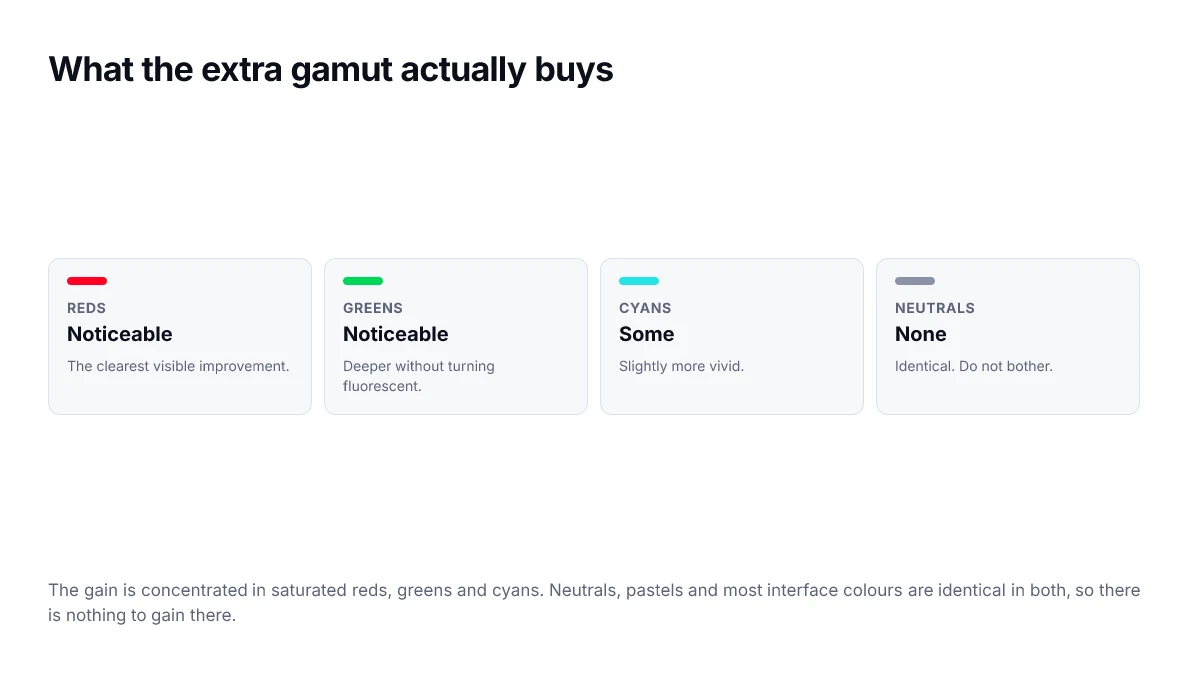
A wider colour space, covering around 25% more of visible colour than sRGB. The gain is not evenly distributed — it is concentrated in saturated reds and greens, with smaller gains elsewhere. Neutral greys and muted tones are effectively identical in both.
That distribution matters for deciding whether to bother. If your palette is mostly muted and neutral, P3 buys you nothing. If you have a vivid accent, it can look meaningfully better.
The syntax
.accent {
  /* every browser understands this */
  color: #FF0022;

  /* wide-gamut browsers on capable screens take this instead */
  color: color(display-p3 1 0 0.13);
}
The cascade does the work. A browser that does not understand color() discards the second declaration as invalid and keeps the first. No feature query needed for the basic case.
Querying the screen directly
When you want to change more than a single value — say, a whole palette — a media query is cleaner than repeating fallbacks everywhere.
:root {
  --accent: #FF0022;
}

@media (color-gamut: p3) {
  :root {
    --accent: color(display-p3 1 0 0.13);
  }
}
OKLCH reaches P3 too
If you are already authoring in OKLCH, you get some of this for free — OKLCH can describe colours outside sRGB, and browsers will render them on capable screens. The catch is that pushing chroma up produces values that get gamut-mapped on ordinary displays, sometimes in ways that shift the hue.
Where it is worth doing
- A single vivid brand accent — the highest return for the least work.
- Data visualisation with many categorical series, where extra gamut means more distinguishable hues.
- Product photography and anything where colour fidelity is the point.
And where it is not: body text, neutrals, borders, and anything whose job is to recede. Those are identical in both spaces, so the extra declaration is pure noise.
Do not skip the fallback
A P3-only colour on a non-P3 screen is not a slightly duller colour — it is an invalid declaration, and the element falls back to whatever it inherited. Always declare the sRGB value first.
Checking whether a colour is even out of gamut
Before adding a P3 variant, it is worth knowing whether the colour you have is actually limited by sRGB. Many are not. A quick way to tell is to express it in OKLCH and look at the chroma: values that sRGB cannot reach are concentrated at high chroma in the red, green and cyan regions.
- Neutrals and near-neutrals are identical in both spaces. No variant needed.
- Pastels sit well inside sRGB. No variant needed.
- Saturated mid-lightness reds, greens and cyans are where the gain is.
- Very dark or very light colours cannot carry much chroma in any space, so the gain is small.
Keeping both versions in sync
The maintenance risk with two declarations is that someone updates one and not the other, leaving wide-gamut users on an old brand colour. Defining both as custom properties in a single place, and referencing only the properties elsewhere, keeps the pair together.
:root {
  --accent: #FF0022;
}

@media (color-gamut: p3) {
  :root { --accent: color(display-p3 1 0 0.13); }
}

/* everything downstream references the token, never the literal */
.button { background: var(--accent); }Contrast still uses sRGB maths
One consequence that catches people out: the WCAG contrast formula is defined on sRGB values. A P3 colour has to be converted back into sRGB terms before the ratio means anything, and browsers and checkers do this for you — but it means a colour that looks more vivid on a wide-gamut screen does not thereby become more readable.
Practically, measure contrast using the sRGB fallback value. If that passes, the P3 variant will not make it worse, because the two describe the same lightness.
Images have gamuts too
Everything above concerns CSS colours, but photographs have the same issue and it is handled differently. An image tagged with a wide-gamut profile displays correctly on capable screens and is converted for everything else, provided the profile is embedded. Stripping profiles to save a few kilobytes is a common optimisation that produces visibly wrong colour on wide-gamut displays.
- Keep the colour profile embedded in photographic images, particularly product shots.
- Untagged images are assumed to be sRGB, which is right for most exports and wrong for wide-gamut ones.
- If a brand colour appears both as CSS and inside an image, check the two against each other on a P3 screen.
That last check is the one worth doing before launch. A hero image whose background is meant to match a CSS panel behind it will show a visible seam if one is wide-gamut and the other is not.
Frequently asked questions
- How do I know if a visitor's screen supports P3?
- Use the color-gamut media feature. @media (color-gamut: p3) matches when the display can show a meaningfully wider range than sRGB. For a single value you do not need it at all — declare the sRGB colour first and let the cascade discard the P3 one where it is not understood.
- Is Display P3 the same as HDR?
- No. P3 is a wider range of colours at ordinary brightness. HDR is a wider range of brightness, including highlights far above the usual white point. A screen can support one without the other, though many recent displays do both.
- Will P3 colours look oversaturated to some users?
- Only if you author them carelessly. A P3 value that is simply the sRGB colour pushed further out will look more intense on capable screens and identical on others, which can make a design feel inconsistent. Choose the P3 variant deliberately rather than by mechanical conversion.
- Does using OKLCH automatically give me wide gamut?
- It can, because OKLCH can describe colours outside sRGB and browsers render them on capable displays. The caveat is that values beyond the sRGB boundary get gamut-mapped on ordinary screens, sometimes with a visible hue shift, so test on both.
- Is it worth the extra code for most sites?
- For a single vivid brand accent, usually yes, because it is two lines. For a whole palette of muted interface colours, no — those are identical in both spaces, so the extra declarations add maintenance for no visible gain.
Sources
- CSS Color Module Level 4 — predefined colour spaces — W3C
- color() — MDN Web Docs
- @media (color-gamut) — MDN Web Docs