Working out a contrast ratio by hand
The full calculation behind 4.5:1, worked through with real numbers, and what each step is actually correcting for.

Most people take the contrast number from a tool and move on, which is fine. But the calculation explains several behaviours that otherwise look arbitrary, so it is worth walking through once.
Step 1: normalise the channels
Divide each of red, green and blue by 255 so they run 0 to 1. For #4DA374 that is rgb(77, 163, 116), giving 0.302, 0.639 and 0.455.
Step 2: undo the gamma encoding
This is the step people find surprising. sRGB values are not proportional to emitted light — they are encoded so that the limited number of steps is distributed where human vision is most sensitive. To do physics on them you have to decode first.
for each channel c (0..1):
  if c <= 0.03928:  linear = c / 12.92
  else:             linear = ((c + 0.055) / 1.055) ^ 2.4
Applying that to our three values gives roughly 0.0742 red, 0.3662 green and 0.1746 blue.
Skipping this step is the single most common mistake in a hand-rolled contrast function. Weighting the raw sRGB numbers gives a plausible-looking result that is quietly wrong.
Step 3: weight and sum
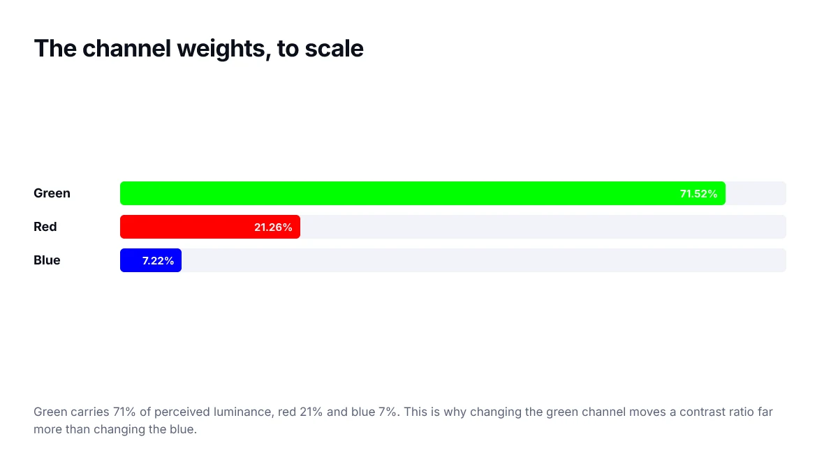
L = 0.2126 * R_linear + 0.7152 * G_linear + 0.0722 * B_linear

L = 0.2126(0.0742) + 0.7152(0.3662) + 0.0722(0.1746)
  = 0.01577 + 0.26192 + 0.01261
  = 0.2903
Those weights come from human sensitivity to each part of the spectrum. Green dominates because our vision is most sensitive there, which is why a vivid green can look bright and still fail against white.
Step 4: form the ratio
contrast = (L_lighter + 0.05) / (L_darker + 0.05)

against white (L = 1.0):
  (1.0 + 0.05) / (0.2903 + 0.05) = 1.05 / 0.3403 = 3.09

so #4DA374 on white is 3.09:1
That figure matches what the colour page for this shade reports, which is a reasonable way to check your arithmetic.
Where the 0.05 comes from
It models ambient light reflecting off a screen that is displaying black. A real display in a real room is never truly black, so the formula never divides by zero and the scale tops out at 21:1 rather than at infinity.
What this explains
- Why adjusting lightness moves the ratio predictably, while adjusting hue barely does.
- Why blue text on white passes more easily than green text of similar apparent brightness.
- Why the maximum possible ratio is 21:1 and not something unbounded.
- Why two colours that look equally bright can score very differently.
Implementing it
The whole calculation is short enough to write out, and worth having in a test suite so contrast is checked automatically rather than remembered.
const channel = (v) => {
  const s = v / 255;
  return s <= 0.04045 ? s / 12.92 : ((s + 0.055) / 1.055) ** 2.4;
};

const luminance = ([r, g, b]) =>
  0.2126 * channel(r) + 0.7152 * channel(g) + 0.0722 * channel(b);

export function contrastRatio(a, b) {
  const [hi, lo] = [luminance(a), luminance(b)].sort((x, y) => y - x);
  return (hi + 0.05) / (lo + 0.05);
}
The sort matters. The formula requires the lighter colour on top, and passing the arguments the other way round produces a ratio below 1 rather than an error — a bug that silently reports everything as failing.
Why the gamma step cannot be skipped
It is tempting to average the raw channel values and call it brightness. That gives the wrong answer, because the numbers in a hex code are gamma-encoded: the encoding devotes more precision to dark tones, where the eye is more sensitive to small differences. Undoing that encoding is what turns a storage value into a quantity of light, and it is the step most naive implementations omit.
Why two colours can swap and give the same answer
The formula is symmetric by construction: it sorts the two luminances before dividing, so the ratio of black on white equals the ratio of white on black. That is convenient, and it is also the main criticism of the model.
In practice, light text on a dark background and dark text on a light background do not read identically at the same measured ratio. Thin light glyphs on dark tend to bloom slightly, appearing heavier than their dark-on-light equivalent. The current formula cannot express that, which is one of the problems the APCA work is trying to address.
This is not a reason to ignore the current thresholds. It is a reason to give dark themes a little more headroom than the minimum, since the model is known to be least accurate exactly there.
Sanity-checking an implementation
A handful of known values will catch nearly every implementation error, and they are worth committing as test cases.
| Pair | Expected ratio | Catches |
|---|---|---|
| #FFFFFF on #000000 | 21:1 | The offset and the overall scale |
| #FFFFFF on #FFFFFF | 1:1 | Identical colours, no division error |
| #000000 on #FFFFFF | 21:1 | Argument order handling |
| #767676 on #FFFFFF | 4.54:1 | The gamma step — this fails without it |
| #0000FF on #FFFFFF | 8.59:1 | Channel weighting, blue especially |
The grey row is the important one. An implementation that skips the transfer function and averages raw channels will report roughly 3.4:1 for it, which is wrong in the direction that quietly fails accessible colours.
Frequently asked questions
- Why is the green coefficient so much larger than the others?
- Because human vision is most sensitive to wavelengths in the green part of the spectrum. The coefficients approximate that sensitivity, which is why changing the green channel moves the contrast ratio far more than changing blue by the same amount.
- Why add 0.05 to both terms?
- It models the small amount of ambient light that reflects off any real screen, so nothing is ever perfectly black in practice. Without it, contrast against pure black would be infinite, which does not correspond to anything a person experiences.
- What is the maximum possible contrast ratio?
- 21:1, which is pure white against pure black. The 0.05 offset is what caps it: (1.0 + 0.05) divided by (0.0 + 0.05) equals 21.
- Does this formula account for font size or weight?
- No. The formula measures colour only. Size and weight enter the standard separately, through the lower 3:1 threshold granted to large text, on the reasoning that thicker strokes remain legible at lower contrast.
- Is there a better model than this one?
- APCA, developed for a future version of the guidelines, models lightness perception and polarity more accurately, and notably treats dark-on-light and light-on-dark differently. It is not the conformance standard today, so build against the current formula and treat APCA as additional insight.
Sources
- WCAG 2.2 — Contrast (Minimum) — W3C
- Relative luminance — W3C
- sRGB transfer function — W3C