Choosing brand colours: constraints before taste
A brand colour has to survive contrast requirements, dark mode, print and being sat next to itself. Narrow the field first, then pick the one you like.
The usual process is backwards. A colour gets chosen because it feels right on a mood board, and only later does anybody discover that it fails contrast as a button, glares in dark mode and cannot be printed.
Constraint 1: it needs two shades, not one
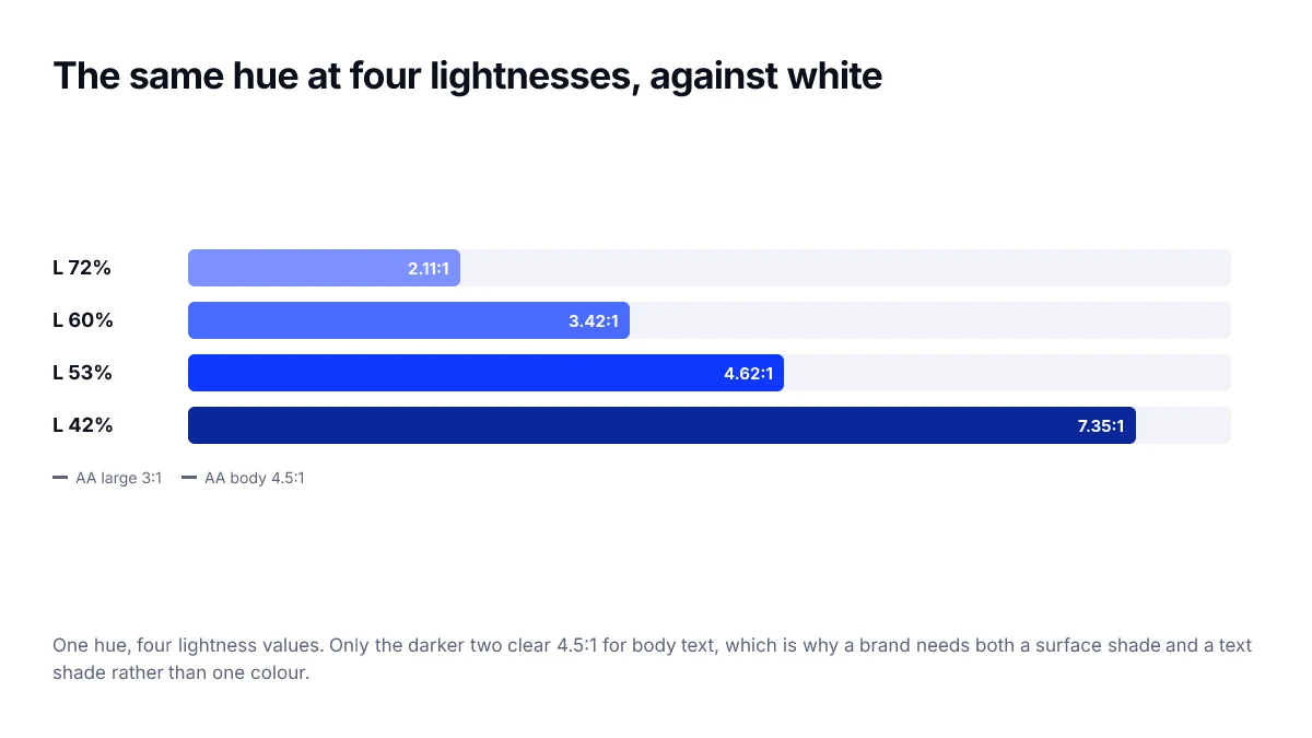
A brand colour does two different jobs. It is a surface with white text on it, and it is text on a white surface. Those two jobs almost never accept the same lightness.
- Find the lightness where white text on the colour clears 4.5:1. That is your surface shade — the button background.
- Find the lightness where the colour on white clears 4.5:1. That is your text shade — links, headings.
- If those are far apart, that is fine and normal. Ship both and name them clearly.
A common trap: a mid-lightness brand colour that fails both. It is too light for text on white and too light for white text on it. Very saturated yellows, oranges and greens land here constantly.
Constraint 2: it has to work in dark mode
Saturated colours intensify against dark backgrounds. Check early whether the hue you are considering still reads as itself when lightened and slightly desaturated for a dark theme, or whether it turns into a different colour entirely.
Constraint 3: printability, if it matters
If the brand will appear on packaging, signage or stationery, check the colour against a CMYK gamut before committing. Vivid blues and greens are the usual casualties. If it only works on a screen, know that going in.
Constraint 4: distinctness
Put your candidate next to the three competitors a customer is most likely to confuse you with. Whole categories converge on the same blue, and being the fourth one is an expensive way to be forgettable.
Now choose
Work those four constraints and you typically go from an infinite field to a handful of viable hues. That is the point at which taste is useful, and the point at which it is safe.
The order matters more than the criteria. Taste first produces a colour you then have to defend; constraints first produces a colour you get to enjoy.
Testing a candidate before committing
A colour that looks right on a moodboard can fail as soon as it has to do interface work. Before adopting one, put it through the situations it will actually face.
- Fill a button with it and put white text on top. Measure. Then try dark text and measure again.
- Place it as a link colour in a paragraph of body text on your page background.
- Put it on your dark theme background and see whether it still reads as the same colour.
- Shrink it to a 16-pixel icon and check it is still identifiable.
- Convert it to greyscale and confirm it does not collapse into your neutral ramp.
- Print a page containing it, if print matters to the brand.
One colour is a system, not a swatch
The output of this process is never a single value. It is a small family: a base for large areas, a darker variant that carries white text, a lighter tint for backgrounds and hover states, and a dark-theme version lifted in lightness. Choosing a brand colour without planning that family is what leads to teams inventing ad-hoc shades six months later.
Writing the decision down
A brand colour that exists only as a hex code in a design file gets re-derived, approximated and slowly drifted. What prevents that is a short document recording not just the values but the constraints they satisfy, so a future change can be evaluated rather than guessed at.
| Record | Why it matters later |
|---|---|
| The sRGB and CMYK values | Stops two teams deriving different conversions |
| The darker variant and its measured ratio | Prevents someone using the base for white text |
| The dark-theme variant | Stops an ad-hoc lightening in a hurry |
| What it must contrast against | Makes a proposed change testable |
| What it is not for | Keeps the accent from becoming body text |
When to change a brand colour
Rarely, and not because it has stopped feeling fresh. Recognition is built slowly and lost quickly, and the cost of a change is paid across every surface the brand touches. There are two good reasons: the colour cannot be made accessible for its required uses, or it is genuinely indistinguishable from a direct competitor's.
If the reason is accessibility, note that you usually do not need a new brand colour — you need a darker functional variant for text-bearing surfaces, with the original kept for large areas where contrast is not at issue.
Frequently asked questions
- Can I use my brand colour for body text?
- Usually not, and you should not want to. Brand colours are chosen to stand out, which is the opposite of what reading text needs. Reserve the brand colour for actions and accents, and use a near-neutral for text so the brand colour keeps its signalling power.
- Then you need a darker variant of it for that purpose. This is normal and does not mean the brand colour is wrong — it means the palette needs two shades, one for large decorative areas and a darker one that carries white text at 4.5:1.
- Should I avoid colours my competitors use?
- Within your category, distinctness has real value, because colour is one of the fastest recognition cues there is. Outside your category it matters much less. Check the handful of products your users will see alongside yours, not the whole market.
- How do I pick a colour that works in print and on screen?
- Start from what CMYK can reproduce, because that is the narrower constraint, and confirm the screen version afterwards. Very saturated blues and greens are the usual casualties — they look excellent on a display and dull on paper.
- Does colour psychology help with this decision?
- Less than the popular claims suggest. Evidence for specific emotional responses to specific hues is weak and highly context-dependent. Category convention, contrast and consistency are far more reliable inputs than a chart of what each colour supposedly means.