Contrast is not only about text
Icons, borders, focus rings, form fields and chart series all have contrast requirements, and they are the ones teams miss.

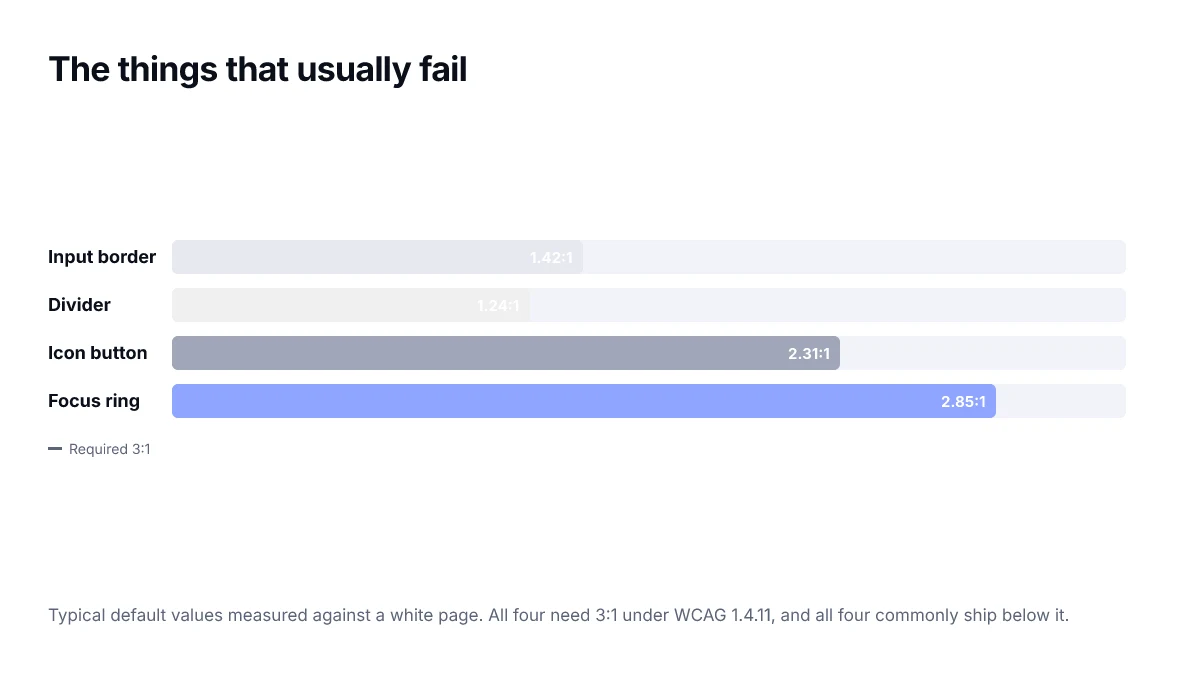
Teams get diligent about text contrast and then ship an input whose border is barely visible, a focus ring nobody can see, and a chart whose series are told apart only by pale colours. All three have requirements, and all three are missed constantly.
The rule
WCAG 1.4.11 asks for 3:1 against adjacent colours for two categories: the visual information needed to identify a user interface component and its state, and the parts of a graphic required to understand the content.
The phrase required to understand is doing the work. A purely decorative flourish is exempt. The border that tells you where an input is, is not.
The usual failures
| Element | Why it fails | Fix |
|---|---|---|
| Input border | A very light grey looks tidy | Darken until it clears 3:1 on the page background |
| Focus ring | Uses the brand colour, which is light | Use a dedicated focus colour, or add a second offset ring |
| Icon-only button | Icon is a muted grey | Icons carrying meaning need 3:1, same as a border |
| Toggle off state | Off and disabled look identical | Different states need to be distinguishable from each other |
| Chart series | Pastel palette | 3:1 between adjacent series, or direct labels |
Focus indicators deserve their own attention
A focus ring is the only thing telling a keyboard user where they are. It must contrast with the background and with the component it surrounds — which is why a ring in your brand colour often fails on a page that already uses that colour.
/* a ring that works on light and dark surfaces */
:where(a, button, input, select, textarea):focus-visible {
  outline: 2px solid var(--focus);
  outline-offset: 2px;
}

:root { --focus: oklch(0.45 0.20 264); }
[data-theme="dark"] { --focus: oklch(0.78 0.16 264); }
The offset matters. A ring drawn tight against a button of similar colour can meet the contrast requirement on paper and still be hard to see; a two-pixel gap puts it against the page background instead.
Charts are the hardest case
A chart needs adjacent series distinguishable from each other, not just from the background. With more than about five series, colour alone stops being sufficient regardless of contrast, and you need direct labels, dash patterns or markers.
A five-minute audit
- Tab through a page and watch the focus ring. If you lose it anywhere, that is a failure.
- Measure one input border against its background.
- Measure one icon-only button against its background.
- Put a toggle in each state side by side and check they differ by more than a tint.
- Screenshot a chart, desaturate it, and see whether the series are still separable.
Building the requirement into components
The reason non-text contrast fails so consistently is that it is checked at the end, on a finished page, when changing a border colour means touching a dozen components. Encoding it in the tokens instead makes the correct value the default.
:root {
  /* measured at 3:1 against --surface, not chosen by eye */
  --border-strong: oklch(0.62 0.01 264);
  --focus:         oklch(0.45 0.20 264);
}

input, select, textarea { border: 1px solid var(--border-strong); }

:where(a, button, input, select, textarea):focus-visible {
  outline: 2px solid var(--focus);
  outline-offset: 2px;
}
Naming the token border-strong rather than border-grey is deliberate. It records that the value exists to meet a requirement, which makes it much less likely that someone lightens it later because it looked heavy in one screenshot.
What automated tools will not catch
Automated checkers are good at text contrast and largely blind to this criterion, because deciding whether a graphic is required to understand the content is a judgement call. Expect to find these by hand — which is why the five-minute audit above is worth running before each release rather than hoping a tool will flag it.
States need to differ from each other
A point that the 3:1 figure obscures: the requirement is about identifying a component and its state, which means the states have to be distinguishable from one another, not only from the background. A toggle whose on and off positions both pass against the page but differ from each other by a faint tint has not met the intent.
- Checked and unchecked checkboxes should differ by more than fill colour — a tick mark does the work.
- Selected and unselected tabs need a border, weight change or indicator, not only a colour shift.
- Toggle on and off benefit from the handle position, which is a non-colour signal already.
- Disabled should be visibly inactive without being invisible.
Where the requirement does not apply
It is worth being precise about the exemptions, because over-applying the rule produces heavy, cluttered interfaces and makes teams dismiss the criterion entirely.
| Element | Applies? | Why |
|---|---|---|
| Purely decorative divider | No | Carries no information |
| Divider that groups form sections | Yes | Communicates structure |
| Logo | No | Explicitly exempt |
| Icon duplicating adjacent text | No | Text carries the meaning |
| Icon-only button | Yes | It is the only label |
| Inactive control | No | Exempt while disabled |
The pattern in that table is consistent: if removing the element would lose information the user needs, it has to be perceivable. If it would only look plainer, it does not.
Frequently asked questions
- Do icons need to meet contrast requirements?
- Icons that convey information or identify a control need 3:1 against their background under WCAG 1.4.11. Purely decorative icons that duplicate adjacent text are exempt, but an icon-only button is the control's only label and must pass.
- What contrast does a focus indicator need?
- 3:1 against the adjacent background. In practice an offset ring is easier to get right than a tight one, because the gap puts the indicator against the page rather than against a button of similar colour.
- Are input borders really required to pass?
- Yes, where the border is what identifies the field. A very light grey border is one of the most common non-text contrast failures, precisely because it looks tidy in a design file and disappears on a real screen in bright light.
- Do disabled controls need to meet contrast?
- WCAG exempts inactive components. Users still need to perceive that the control exists, though, so an entirely invisible disabled state is a usability problem even where it is not a conformance failure.
- How do I handle a chart with many series?
- Past about five categories, colour alone stops being sufficient no matter how carefully it is chosen. Add direct labels on the series, or vary line style and marker shape, so the chart does not depend on distinguishing similar hues.