Designing for colour blindness without designing in grey
Around one in twelve men has some colour vision deficiency. Here is what that actually changes about your interface, and what it does not.
Colour vision deficiency is not rare. Roughly one in twelve men and one in two hundred women has some form, most commonly a reduced ability to distinguish red from green. On any product with real users, some of them see your palette differently from you.
What it actually affects
The common forms compress part of the spectrum rather than removing colour entirely. Reds and greens converge; blues and yellows usually stay distinct. Complete absence of colour vision exists but is very rare.
The practical consequence is narrow and specific: any place where red and green are the only difference between two states is a place where information disappears.
The single rule that matters
Never let colour be the only carrier of meaning. That is WCAG 1.4.1, and almost every real failure is a version of it — a red border marking an invalid field, a green dot meaning online, a chart line identified only by its colour in a legend.
Notice that the rule does not say use less colour. Colour is a fast, useful signal. It just needs a partner.
What partnering looks like
| Pattern | Colour alone | Add |
|---|---|---|
| Form validation | Red border | An icon and a message under the field |
| Status dot | Green or red circle | A shape difference, or a text label |
| Chart series | Legend by colour | Direct labels, or dash patterns |
| Required field | Red asterisk | The word required in the label |
| Selected item | Tinted background | A check mark or a border weight change |
Two checks that take a minute
- View the screen in greyscale. Your operating system has a filter for this. If two states become indistinguishable, colour is doing too much work.
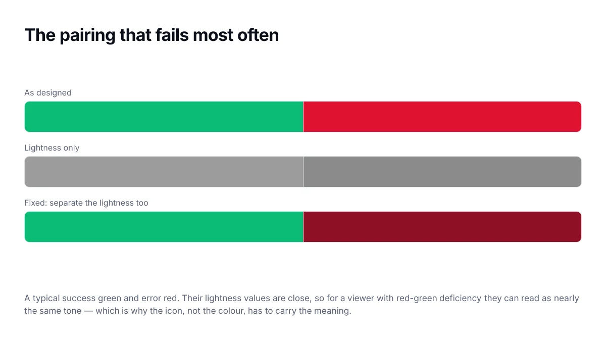
- Separate the lightness of any red and green that appear together. If the red and the green have similar lightness, they will converge for some viewers even before any deficiency is involved.
What this does not require
It does not require a monochrome interface, and it does not require avoiding red and green together. A red delete button and a green confirm button are fine when they also differ in position, label and icon — which they almost always do.
The goal is redundancy, not restraint. Say the same thing twice, in two channels, and the design works for everybody.
Applying the rule to common patterns
| Pattern | Colour alone | With a partner signal |
|---|---|---|
| Form validation | Red border | Red border plus an icon and message text |
| Status badge | Green dot | Green dot plus the word Active |
| Required field | Red asterisk colour | Asterisk plus the word required in the label |
| Chart series | Five pastel lines | Direct labels, or markers and dash patterns |
| Link in body text | Brand colour | Colour plus an underline |
| Diff view | Red and green rows | Plus and minus signs in the gutter |
Where colour still does real work
It is worth being clear that the rule is about redundancy, not removal. Colour remains the fastest way to draw the eye, to group related things, and to signal severity before anyone has read a word. Someone with a red-green deficiency still perceives that an error state differs from a resting state — they may simply not perceive it as red.
So the goal is not a monochrome interface. It is an interface where colour is the fast path and something else is the reliable path.
The types, briefly
You do not need clinical detail to design well, but knowing roughly what is affected helps you predict which pairs will collide.
| Type | Affects | Colours that collide |
|---|---|---|
| Deuteranomaly | Most common form | Red and green, greens and browns |
| Protanomaly | Red sensitivity reduced | Red and green; reds appear darker |
| Tritanomaly | Rare | Blue and green, yellow and violet |
| Achromatopsia | Very rare | All hues; only lightness remains |
The practical implication of that table is that red-green pairs are the highest risk, and that a blue-yellow alternative is safer for most people but not for everyone. Which is why the structural rule, rather than a specific safe palette, is what you actually build against.
Lightness is the reliable channel
Whatever hue is or is not perceived, differences in lightness survive. That makes lightness the most robust way to distinguish elements: two colours that differ substantially in lightness remain distinguishable under every form of colour vision deficiency, including complete loss of hue perception.
This is why the desaturation check works so well as a single test. If the design survives with hue removed entirely, it survives every partial deficiency too.
Frequently asked questions
- How many people does this affect?
- Colour vision deficiency affects roughly one in twelve men and one in two hundred women of northern European descent, with red-green types by far the most common. On any site with meaningful traffic that is a substantial group, and none of them are edge cases.
- Is it enough to avoid red and green together?
- No, and it is the wrong mental model. The requirement is that colour is never the only thing carrying information. A red-green pair with a text label, an icon and a position is fine; a blue-purple pair with nothing else is not, even though it avoids red and green.
- Do colour blindness simulators tell me if my design passes?
- They are useful for spotting obvious collisions, but they simulate a few common types at full severity and cannot represent the range of real vision. Use one to catch problems, not to certify that there are none. The structural rule — never colour alone — is what you actually rely on.
- What about people with total colour blindness?
- Achromatopsia is rare but real, and it is the reason the desaturation check is worth doing. If a screenshot converted to greyscale still communicates everything it needs to, the design does not depend on hue at all.
- Does this mean my interface has to be boring?
- No. Colour can still do all the work of setting tone and drawing attention. The constraint is only that it must not be the sole carrier of meaning — which usually means adding a label or an icon, not removing colour.