Colour harmonies, and when each one actually works
Complementary, triadic, analogous and the rest — what the colour wheel maths does, and the practical rule that stops any of them looking chaotic.

A colour harmony is a rule for picking companion colours by their position on the wheel. The rules are simple arithmetic on the hue angle. What they cannot do on their own is tell you how much of each colour to use, and that is where most palettes go wrong.
Complementary: 180 degrees apart
Take your hue and add 180. You get the strongest contrast available, which is exactly why it is easy to misuse. Two colours fighting at equal strength across a layout is tiring to look at.
Let one colour lead and use the other only for accents — a call to action, an active state, a highlight. A 90/10 split usually beats 50/50.
Split complementary: 150 and 210 degrees
Instead of the exact opposite, take the two hues sitting either side of it. You keep most of the contrast but lose the harshness, and you get three colours to work with rather than two. This is the safest high-contrast scheme for interfaces.
Triadic: three hues, 120 degrees apart
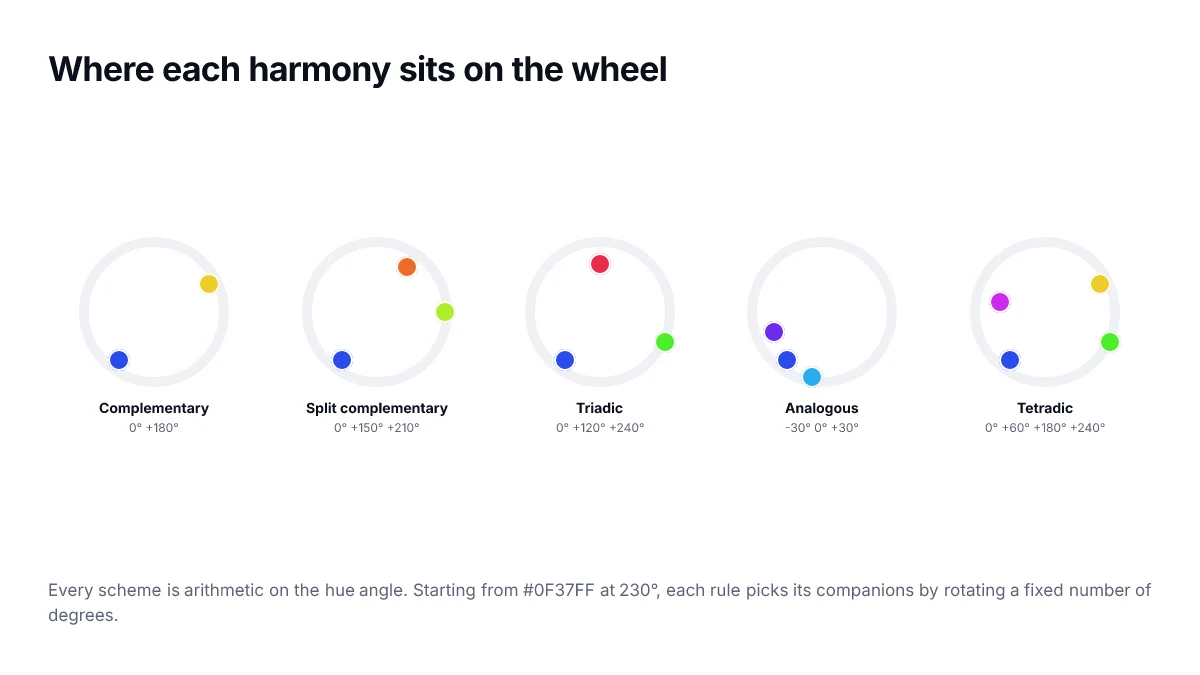
Evenly spaced around the wheel. Balanced and energetic, and genuinely hard to control because all three want equal attention. The fix is the same as for complementary: choose a dominant hue, then desaturate or lighten the other two so they support rather than compete.
Analogous: neighbours, 30 degrees apart
Three hues sitting next to each other. Low contrast, naturally calm, and the reason so many gradients and backgrounds use it. The weakness is that nothing stands out, so you usually need a colour from outside the scheme for anything that must be noticed.
Monochromatic: one hue, many lightnesses
Not really a harmony so much as a discipline. Fix the hue, vary lightness and saturation. It is the most reliable route to an interface that looks deliberate, and it is what most design systems quietly do for their neutral and primary ramps.
Tetradic: two complementary pairs
Four hues forming a rectangle on the wheel. The richest scheme here and the one that needs the most restraint — four colours at equal weight will always look chaotic. Treat it as one dominant colour, one secondary, and two accents used sparingly.
The rule that matters more than the scheme
Every harmony above assumes equal saturation and lightness, which is almost never what you want. Once you have your hues, vary the other two properties so the colours have a clear hierarchy.
- Pick one colour to dominate — it should cover most of the surface.
- Desaturate supporting colours so they recede.
- Reserve your most saturated colour for the single thing you want clicked.
- Check contrast before committing: a harmony that fails WCAG is not usable, however pleasant it looks.
Every colour page on this site generates all six schemes from whatever colour you are looking at, and each one can be sent straight to the gradient builder.
Choosing a scheme by what you need
| If you want | Use | Watch out for |
|---|---|---|
| Maximum emphasis on one action | Complementary | Vibration when both are saturated |
| Contrast without harshness | Split complementary | Slightly harder to balance |
| A playful, varied feel | Triadic | Three strong hues can compete |
| Calm and cohesive | Analogous | Too little contrast for hierarchy |
| A restrained, serious feel | Monochromatic | Relies entirely on lightness |
Adjust saturation before you abandon a scheme
Most harmonies that look wrong are not wrong in hue — they are wrong in saturation. A triadic scheme at full saturation is exhausting; the same three hues with one dominant and two pulled back to a fraction of their chroma is a usable palette.
A practical ratio to start from is roughly sixty percent neutral, thirty percent your dominant hue, and ten percent the accent. That leaves the accent genuinely accenting something rather than fighting for space.
Harmony is not the last step
- Pick hues with a harmony, so the relationships are deliberate rather than accidental.
- Set lightness for each role by contrast requirement, not by what looks pleasant in isolation.
- Pull saturation down on everything that is not meant to draw the eye.
- Check every text pairing against the contrast thresholds before committing.
- Look at the result desaturated, to confirm hierarchy survives without hue.
Frequently asked questions
- Do colour harmonies guarantee a good palette?
- No. A harmony tells you where hues sit relative to one another on the wheel; it says nothing about lightness, saturation or contrast, which are what actually determine whether an interface is readable. Treat a harmony as a starting point for hue selection, then set the other channels deliberately.
- How many colours should a brand palette have?
- For most interfaces, one primary hue, one accent, a full neutral ramp, and four feedback colours for success, warning, error and information. Adding more hues usually reduces clarity, because each additional colour has to earn a distinct meaning that users can learn.
- Why does my complementary pair look harsh?
- Because two fully saturated complements at similar lightness compete for attention and can produce a shimmering edge where they meet. Keep one of the pair dominant and desaturate or lighten the other, so the relationship stays but the vibration goes.
- Is the RGB colour wheel the same as the one I learned in art class?
- No. The traditional artists' wheel is built on red, yellow and blue primaries and puts the complement of red at green-blue. The RGB wheel used by CSS puts the complement of red at cyan. Both are internally consistent; harmonies calculated on one do not transfer directly to the other.
- Can I use a harmony for data visualisation?
- Only for a small number of series. Harmonies space hues evenly, which is helpful, but they do not guarantee that adjacent colours differ enough for readers with colour vision deficiencies. Past about five categories you need direct labels or non-colour signals regardless of the scheme.
Sources
- CSS Color Module Level 4 — hue interpolation — W3C
- hsl() colour function — MDN Web Docs