What colour actually communicates in an interface
Colour psychology is oversold. What holds up is convention, contrast and consistency — and those are enough to design with.
Search for colour psychology and you will find confident charts assigning emotions to hues. Most of it does not survive contact with evidence, and designing around it produces decisions you cannot defend.
Why the strong claims are shaky
- Meanings differ across cultures. White signals purity in some and mourning in others. Red signals danger in some and prosperity in others.
- Context dominates hue. The same red means error in a form, sale on a price tag, and record on a camera.
- The famous conversion studies are usually contrast studies. A button that outperformed another was typically the one that stood out more, not the one that was a particular colour.
That last point is worth internalising. If a button test says green beat red, check whether the green simply had more contrast against the surrounding page. It usually did.
What does hold up
Learned convention within a platform is real and useful. Users have seen thousands of interfaces where destructive actions are red, and that expectation is worth meeting. It is not a fact about the wavelength; it is a fact about their experience.
| Signal | Reliable because | Still needs |
|---|---|---|
| Red for destructive | Near-universal in software | A confirm step and a clear label |
| Green for success | Widely learned | An icon, for colour-blind users |
| Amber for warning | Widely learned | Text saying what the warning is |
| Brand colour for primary action | Consistency within your product | Enough contrast to be seen |
Consistency beats meaning
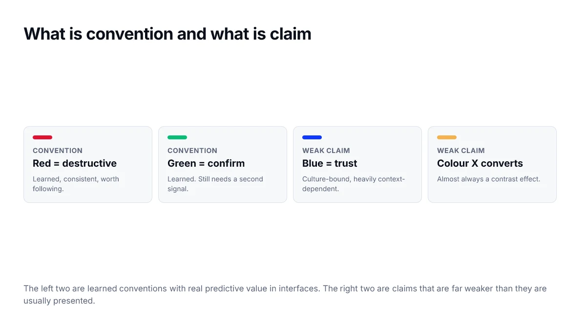
Within one product, the value of a colour comes almost entirely from using it the same way every time. If your accent means this is clickable, it must never also mean this is selected. That internal consistency does more work than any inherited symbolism.
How to use this
- Follow platform convention for destructive, success and warning states.
- Pick the rest of your palette on constraints and taste, not on emotional claims.
- Use each colour for exactly one job across the product.
- Pair every meaning with a non-colour signal.
- If someone proposes a colour change to lift conversion, test it and check the contrast explanation first.
None of this makes colour unimportant. It makes it tractable — a system of learned signals you can design deliberately, rather than a set of moods you have to take on faith.
What to do instead
Replacing the psychology framing with three questions produces better decisions and ones you can defend in a review.
- What convention does this context already carry? Match it unless you have a specific reason not to.
- Does this colour make the important thing on the screen the most prominent thing? That is contrast, and it is measurable.
- Is this colour used the same way everywhere in the product? Inconsistency costs more than any individual hue choice.
Conventions worth keeping
| Signal | Conventional colour | Required partner |
|---|---|---|
| Error or destructive | Red | Icon and message text |
| Success or confirmation | Green | Icon and message text |
| Warning | Amber | Icon and message text |
| Informational | Blue | Icon |
| Primary action | Brand colour | Position and label |
| Visited link | Muted variant | Underline |
The partner column is not optional decoration. It is what makes the signal survive for the roughly one in twelve men who cannot reliably separate the red and green rows of that table.
Reading a study before repeating it
Colour psychology claims circulate largely as secondary summaries, and the summaries are usually stronger than the research they describe. A few questions separate a finding worth acting on from a headline.
- How many participants, and from how many populations? Small single-culture samples do not generalise to a global product.
- Was the effect measured on behaviour, or on self-reported feeling about a swatch? The two rarely agree.
- Was contrast held constant? If not, the result may be about prominence rather than hue.
- Has it replicated? Many of the most-cited colour effects have not.
- Does the claimed effect size matter at your scale, even if it is real?
Applying those questions to the well-known claim that a particular button colour increases conversions usually reveals a single test on a single page where the winning colour also happened to contrast more with its surroundings.
Consistency is the finding that holds
The one robust effect available to you is learning. Users build expectations from your interface within minutes, and an interface that uses a colour the same way everywhere becomes faster to operate regardless of which colour it chose. That is an effect you control completely, and it is larger than anything attributable to hue.
Frequently asked questions
- Does red really make people feel urgent?
- The popular claims are stronger than the evidence supports. Effects reported in the literature tend to be small, highly dependent on context, and difficult to replicate. What is reliable is learned convention: red means error in interfaces because interfaces have consistently used it that way, not because of anything intrinsic to the wavelength.
- Do colour meanings differ between cultures?
- Yes, substantially, particularly for white, red and green in ceremonial contexts. For interface conventions specifically — red for error, green for success — the pattern is fairly widespread, largely because software conventions have propagated globally. Do not assume a decorative colour choice carries the same association everywhere.
- Should I use green for success and red for errors?
- Yes, because users expect it and violating a strong convention costs comprehension for no benefit. Just do not rely on the colour alone — pair it with an icon and text so the meaning survives for people who cannot distinguish the two.
- Does colour affect conversion rates?
- Button colour experiments usually measure contrast rather than colour. A button that stands out from its surroundings gets clicked more, and changing the hue often changes how much it stands out. Attributing the result to the specific colour rather than to its prominence is the common error.
- So is colour psychology useless for design work?
- It is unreliable as a predictor of feeling and useful as a description of convention. Knowing that your category consistently uses a particular colour range is actionable. Knowing that a colour supposedly conveys trust is not.