Making text readable over a photograph
Text on an image is the hardest contrast problem in interface design, because the background changes under every letter. Four techniques that actually work.

A hero image with a headline across it is one of the most common layouts on the web, and one of the most reliably inaccessible. The problem is structural: a contrast ratio is defined between two colours, and a photograph is not one colour.
Why text-shadow is not the answer
A shadow behind white text helps a little on a light patch and does nothing measurable. It cannot be evaluated against any success criterion, it degrades badly at small sizes, and it tends to look muddy. Use it as a finishing touch on top of a real solution, not as the solution.
1. A flat scrim
Put a semi-transparent black or white layer over the entire image. Now the effective background is a known, measurable colour, and you can test it like anything else.
.hero {
  position: relative;
  background-image: url("/hero.jpg");
  background-size: cover;
}

.hero::before {
  content: "";
  position: absolute;
  inset: 0;
  background: rgb(11 15 26 / 55%);
}

.hero > * { position: relative; }
To measure it, sample the lightest pixel of the image, composite it with your scrim, and test white text against that. If the lightest possible background passes, every darker one does too.
2. A gradient overlay
The same idea, but concentrated where the text sits so the rest of the photograph stays visible. This is what most well-executed hero sections use.
.hero::before {
  background: linear-gradient(
    to top,
    rgb(11 15 26 / 85%) 0%,
    rgb(11 15 26 / 60%) 40%,
    rgb(11 15 26 / 0) 100%
  );
}
Fade to the same colour at zero alpha rather than to the transparent keyword, or the fade will drift toward grey.
3. A solid panel
Put the text in its own opaque or near-opaque block. Least fashionable, most reliable, and by far the easiest to verify. Worth choosing when the text really matters — pricing, legal copy, a primary call to action.
4. A blurred backdrop
.panel {
  background: rgb(11 15 26 / 45%);
  backdrop-filter: blur(12px) saturate(120%);
}

@supports not (backdrop-filter: blur(1px)) {
  .panel { background: rgb(11 15 26 / 85%); }
}
Blur reduces local variation, which is exactly the problem you are solving. Always pair it with a fallback that raises the alpha, because a browser without backdrop-filter shows your text over a 45% scrim and that may not pass.
The thing to remember
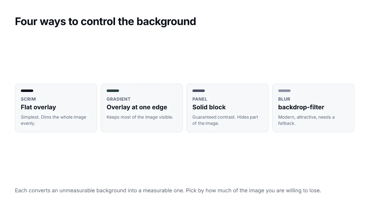
Each technique works by turning an unmeasurable background into a measurable one. Once you have done that, this stops being a special case and becomes an ordinary contrast check.
Measure against the worst case, not the average
The single most common mistake is sampling the image once, in the middle, and checking that. Contrast over an image varies across the text block, and the requirement has to hold everywhere the text sits — including the one bright patch of sky behind the last two words of the headline.
- Screenshot the hero as it renders, at the narrowest and widest breakpoints.
- Find the lightest region that falls behind text for dark text, or the darkest for light text.
- Measure the text colour against that region, not against an average.
- Adjust the scrim until the worst point passes, then confirm the best point has not become murky.
- Repeat for any alternate images that use the same component.
Do not forget the image itself
Whatever treatment you choose, the image still needs an appropriate alt attribute. If it is purely decorative and the headline carries the meaning, an empty alt is correct and preferable to a description of the photograph. If the image conveys information, describe that information rather than the composition.
Choosing between the four approaches
| Technique | Best when | Cost |
|---|---|---|
| Flat scrim | Any image, text anywhere | Darkens the whole photograph |
| Gradient overlay | Text anchored to one edge | Only protects that edge |
| Solid panel | Unpredictable user images | Covers part of the image |
| Blurred backdrop | Modern browsers, light touch | Expensive to render; needs a fallback |
For a marketing hero where you control the photography, a gradient overlay usually gives the best result, because it keeps the image visible where the text is not. For anything user-supplied, a solid panel is the only option that cannot fail.
Responsive behaviour is where these break
A treatment tuned at desktop width frequently fails on a narrow screen, because the crop changes which part of the image sits behind the text. A gradient that covered the lower third of a wide image may cover only a corner once the same image is cropped to portrait.
- Check the hero at the narrowest breakpoint you support, not only the widest.
- If the image is art-directed with different crops, treat each crop as a separate case.
- Anchor the gradient to the text block rather than to the image, so it follows the content.
- Watch for headlines that wrap to an extra line at small sizes and extend past the treated area.
Frequently asked questions
- Can I just add a text shadow?
- A shadow helps at the edges of glyphs but does not change the measured contrast between the text colour and what is behind it, so it does not make a failing combination pass. It is a finishing touch on top of a scrim, not a substitute for one.
- How dark does a scrim need to be?
- Dark enough that the text passes against the darkest point of the blended result, not the average. Measure against the lightest patch of the image under the text, because that is where the ratio is worst. In practice a black scrim between 40 and 60 percent covers most photographs.
- What if the image is user-uploaded and I cannot predict it?
- Then you cannot rely on the image at all, and a solid or near-solid panel behind the text is the only approach that is guaranteed to work. A gradient overlay is a reasonable middle ground if the text is anchored to one edge.
- Does backdrop-filter work everywhere?
- Support is good in current browsers but it is expensive to render and can be disabled by reduced-transparency settings. Always give the element a semi-opaque background colour as well, so the text stays readable when the blur does not apply.
- Should hero text be part of the image instead?
- No. Text baked into an image cannot be selected, translated, read by a screen reader, or resized, and it looks wrong at other viewport sizes. Real text over a treated image is better on every axis.
Sources
- WCAG 2.2 — Contrast (Minimum) — W3C
- backdrop-filter — MDN Web Docs