Opacity, alpha and transparent are not the same
Why opacity on a parent dims its children, why alpha does not, and why fading to transparent produces a grey haze.

Three different mechanisms get called transparency, and mixing them up produces two of the most common CSS bugs: text that fades when you only wanted the box to, and a gradient that turns grey on its way out.
opacity applies to everything inside
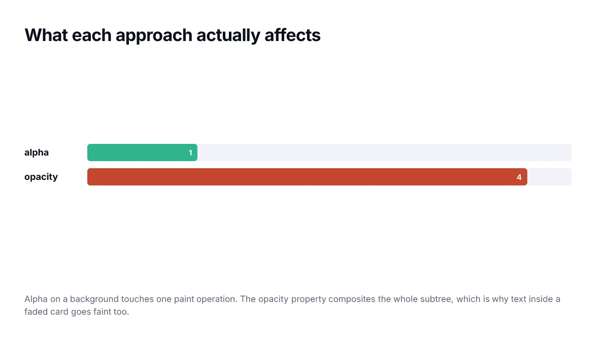
Setting opacity on an element renders that element and all of its descendants as a single group, then makes the whole group translucent. You cannot opt a child back in. A heading inside a card at 0.5 opacity is at 0.5 opacity, and no amount of colour on the heading will restore it.
/* the text fades too — usually not what was wanted */
.card { opacity: 0.5; }

/* only the surface fades; the text stays solid */
.card { background: rgb(15 55 255 / 50%); }
opacity below 1 also creates a new stacking context. That is a frequent cause of z-index behaving strangely: a child with a huge z-index cannot escape a parent that has been given opacity.
Alpha applies to one colour
An alpha channel belongs to a colour value, not an element. It affects exactly the thing it is applied to — a background, a border, a shadow — and nothing else in the subtree.
This is almost always what you want for surfaces, overlays and scrims. Reach for opacity only when you genuinely mean the whole element, such as fading out a component during a transition.
transparent is transparent black
The keyword transparent is defined as rgb(0 0 0 / 0). It has a colour, and that colour is black. In most places this never shows, because fully transparent is fully transparent. In a gradient it shows badly.
/* drifts through grey on the way out */
background: linear-gradient(90deg, #0F37FF, transparent);

/* fades cleanly */
background: linear-gradient(90deg, #0F37FF, rgb(15 55 255 / 0));
The reason is interpolation. The browser blends between the two endpoint colours, and if one endpoint is black at zero alpha, the midpoints carry some of that black even as they fade.
Choosing between them
- Fading a whole component in or out: opacity.
- A translucent panel with readable text on it: alpha on the background.
- A gradient that disappears: fade to the same colour at zero alpha, never to transparent.
- Unexplained z-index behaviour: check whether an ancestor has opacity below 1.
Accessibility consequences of fading text
Both techniques reduce contrast, and contrast requirements apply to the rendered result rather than to the colour you declared. Text at sixty percent alpha over white is measured as the blend, not as the original colour, and a value that passed at full strength will often fail once faded.
This is the most common cause of a palette that measures correctly in a swatch grid and fails on the actual page. Muted captions and metadata are usually where it happens, because fading is the quickest way to make something look secondary.
If you need text to look secondary, use a dedicated muted colour that has been measured against its background. Fading a primary colour produces a value nobody has checked.
A quick decision table
| Goal | Use | Why |
|---|---|---|
| Fade a whole card on hover | opacity | One property, composited cheaply |
| Muted caption text | colour with alpha | Leaves backgrounds and borders alone |
| Tinted overlay on an image | colour with alpha | The element below stays fully opaque |
| Animating something in or out | opacity | Avoids repaint on every frame |
| A translucent border only | colour with alpha | opacity would fade the content too |
How alpha actually composites
The blended result is a weighted average of the two colours, channel by channel, using the alpha as the weight. Black at forty percent over white gives 0.4 times 0 plus 0.6 times 255, which is 153 — a mid grey, and the value any contrast check will actually measure.
// what the browser paints for colour over background
const blend = (fg, bg, alpha) =>
  fg.map((c, i) => Math.round(c * alpha + bg[i] * (1 - alpha)));

blend([0, 0, 0], [255, 255, 255], 0.4); // [153, 153, 153]
Knowing the arithmetic is useful because it lets you work backwards. If you need a muted text colour that measures 4.5:1 against white, you can compute which alpha of your text colour lands there rather than trying values until one passes.
Stacked transparency compounds
Alpha values do not add, they multiply through the stack. A panel at eighty percent inside a container at eighty percent renders at sixty-four percent of full strength, and a third layer takes it to about half. Interfaces built from nested translucent surfaces drift towards invisible in ways that are hard to trace, because no single declaration looks wrong.
If a design uses translucency for depth, cap the nesting at two levels and give the third an opaque colour that matches what the stack would have produced. It is easier to reason about and cheaper to render.
Frequently asked questions
- Does opacity: 0 hide an element from screen readers?
- No. An element with zero opacity is still in the accessibility tree and still focusable, which is a common source of keyboard traps where a user tabs into something invisible. Use visibility: hidden, display: none, or the hidden attribute if the element should genuinely be gone.
- Why does opacity on a parent make my z-index stop working?
- Because any opacity below 1 creates a new stacking context. Children are then stacked relative to that context rather than the page, so a high z-index inside it cannot rise above elements outside it. This catches people out with dropdowns inside faded containers.
- Is opacity or rgba faster?
- Opacity is generally cheaper to animate, because it can be handled by the compositor without repainting. A colour with alpha requires a repaint when it changes. For a static value the difference is irrelevant; for an animation, prefer opacity.
- How do I fade text without fading its background?
- Set the alpha on the colour property rather than using opacity on the element. color: rgb(0 0 0 / 60%) fades only the glyphs; opacity: 0.6 fades the text, its background, its border and everything nested inside.
- What is the difference between transparent and rgb(0 0 0 / 0)?
- Nothing, in value — transparent is defined as transparent black. It matters only in gradients and transitions, where interpolating towards transparent black drags the colour through grey. Fading to the same hue with zero alpha avoids that.
Sources
- CSS Color Module Level 4 — transparent — W3C
- opacity — MDN Web Docs
- Stacking context — MDN Web Docs